I stopped by the opening reception for Patio-de casa by Edson Rosas at White Bear Center for the Arts. This exhibition is on view July 10-August 19, 2023 at 4971 Long Ave. White Bear Lake, MN 55110.
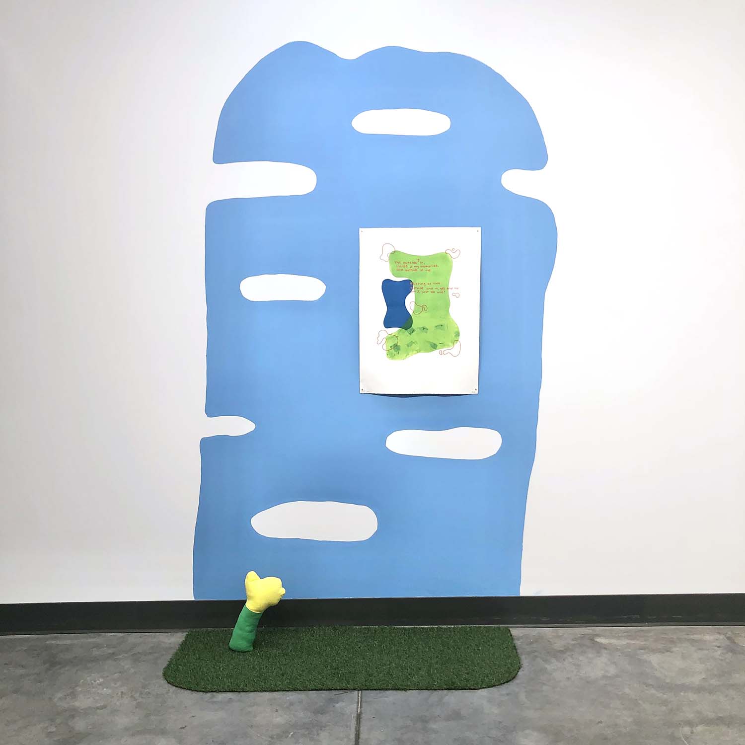
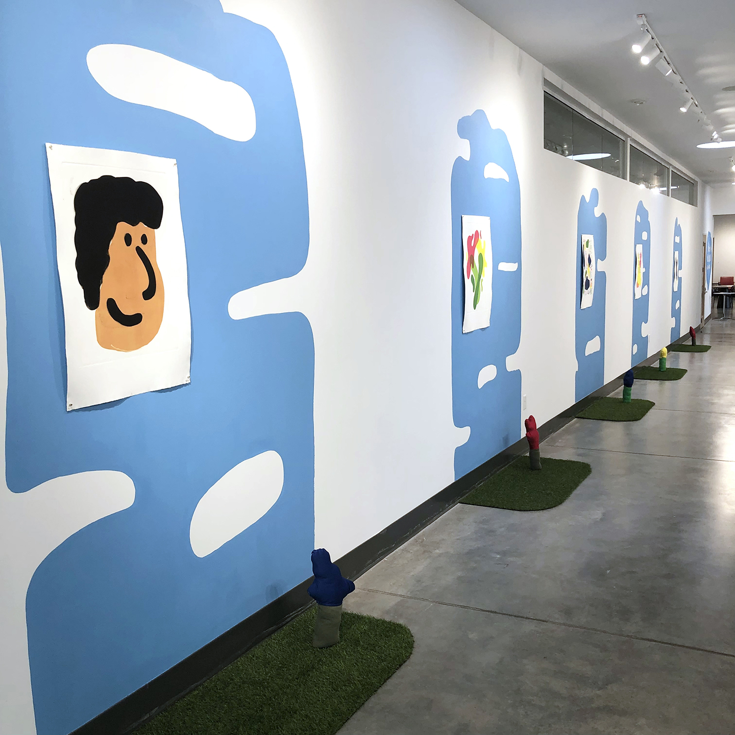
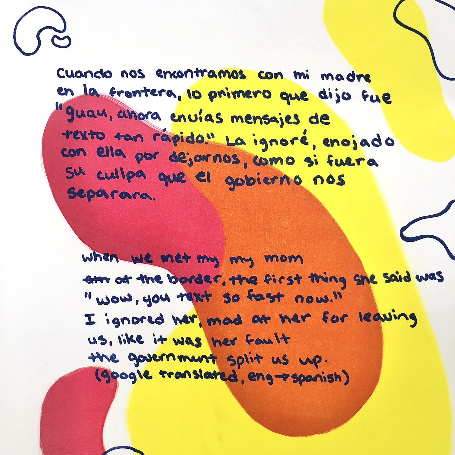
This poignant exhibition contrasts heavy emotional content with soft shapes and highly saturated colors. Rosas highlights his Mexican roots and concepts of home and family through a combination of printmaking, soft sculpture, and installation.
The long gallery furnishes the space for contemplation that the work deserves. Attention to edges and negative space throughout the exhibition provide a softness and safety.
Edson Rosas, Memories in English, monoprint, relief ink, 30″x22″, $350
Playful imagery and a rainbow of colors invite the viewer in for reflection, while the topics of deportation, borders, and translation take center stage. Rosas brings forward messy unresolved systemic issues related immigration and frames them in a deeply personal way for public consideration.
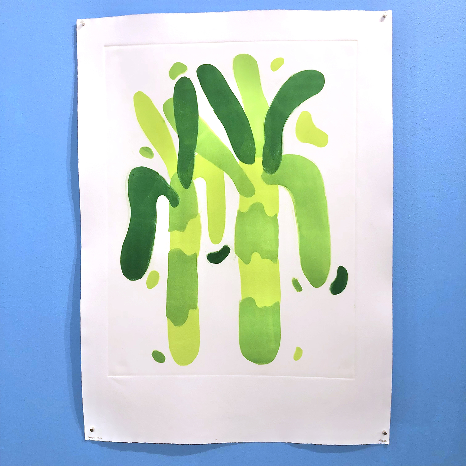
Edson Rosas, Sugar Cane, monoprint, relief ink, 30″x22″, SOLD
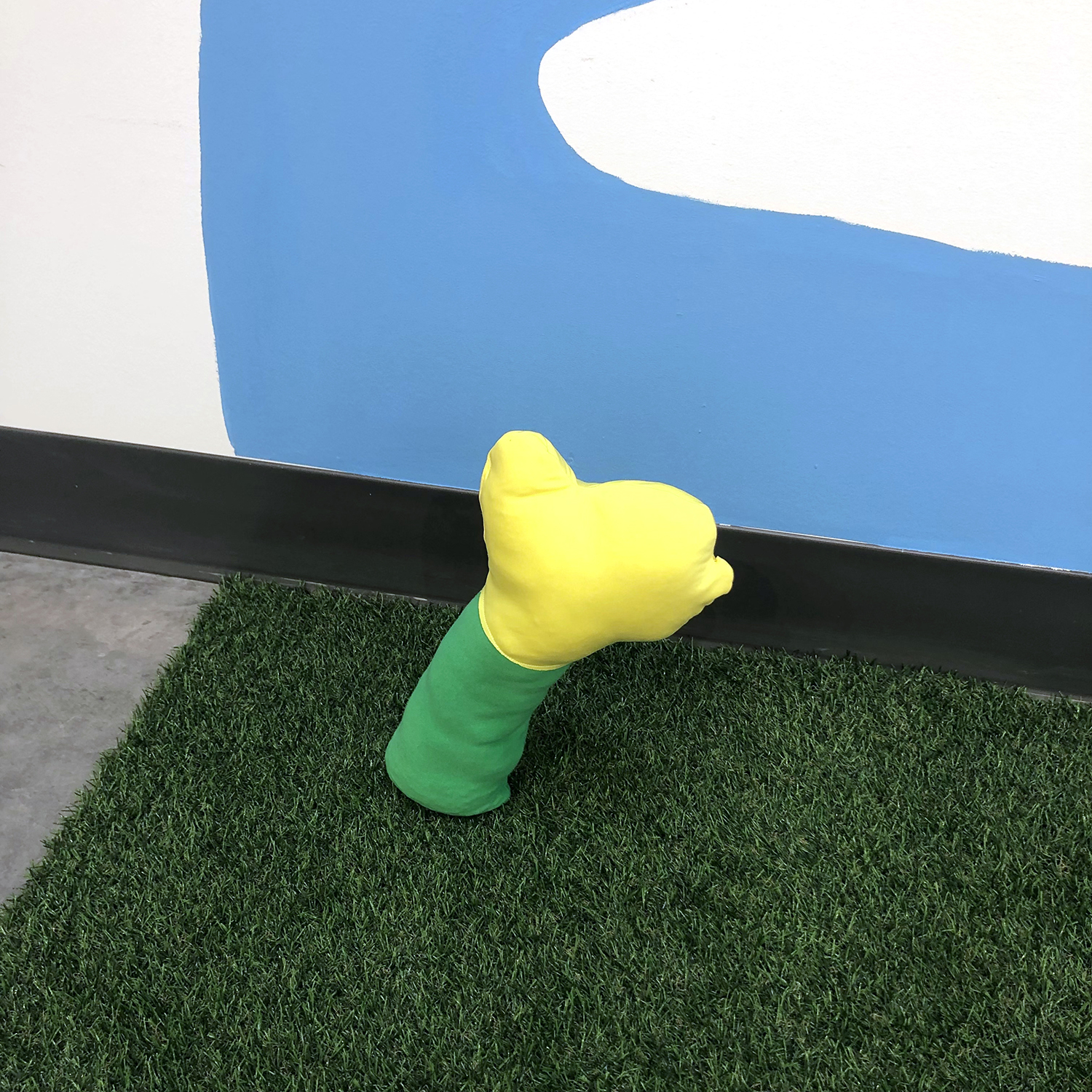
Some works have no text and just indulge in play, color, and shape, which is also welcome.
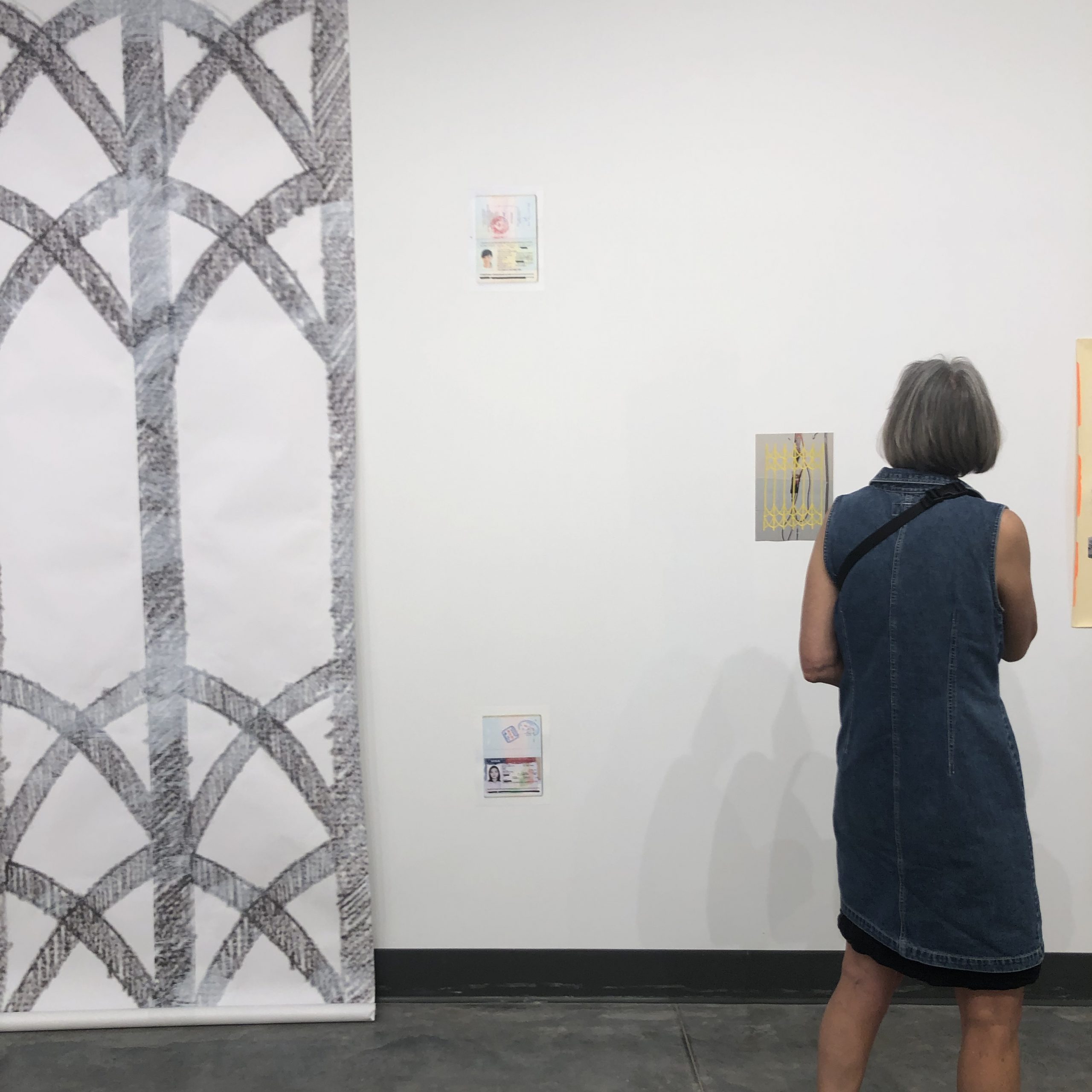
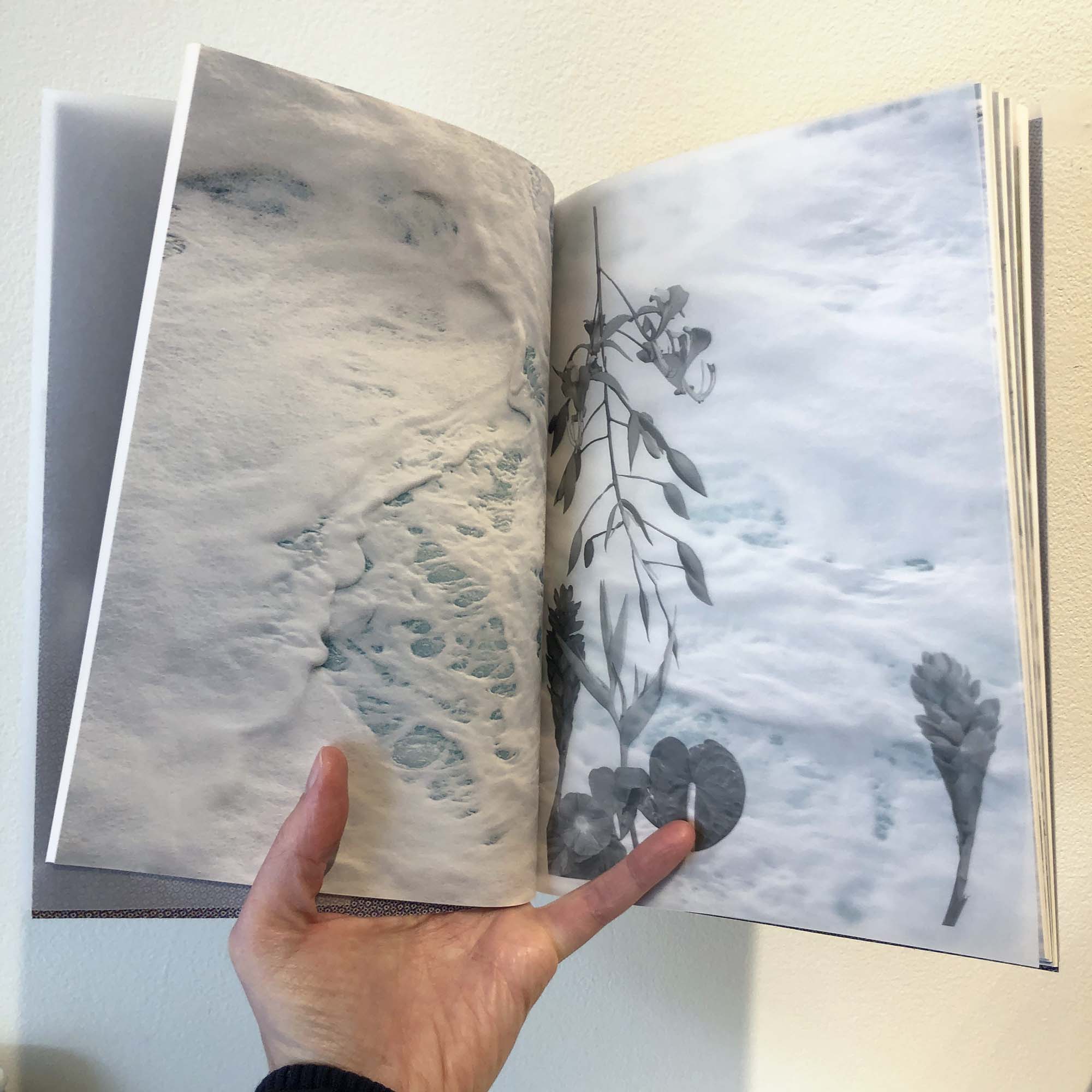
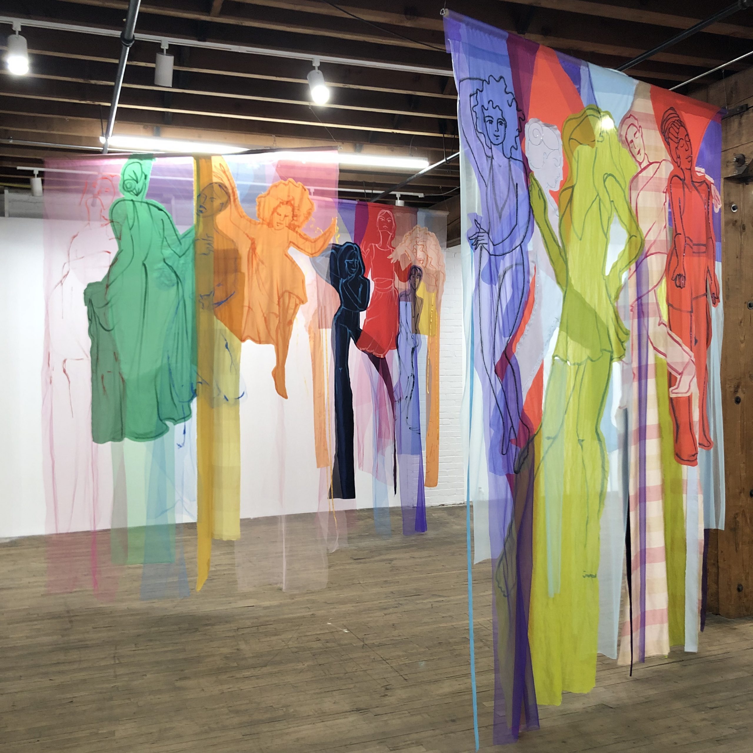
I was lucky to be present for the artist talk on this body of work, and one of the concepts that stood out to me was the squishiness of memories. Genie Hien Tran talked about a gate at her childhood home in Vietnam, and the struggle to remember its exact form once she discovered there were no existing photographs of it. She consulted with relatives, and there was not a consensus. Throughout the show are different interpretations of the gate, creating a visual through-line for the exhibition.
Genie Hien Tran, “Am Phu”
The installation choices felt precise to the concept of memory. On large collaged works, various imagery comes together in what felt like moments of potential clarity, only to scatter again into smaller component parts. Floor-to-ceiling looser drawings of the gates live next to small reproductions of identification material or historic documents related to the American war in Vietnam.
Genie Hien Tran, large drawing: “Remembering”, small yellow gate image: “Untitled (merging)”
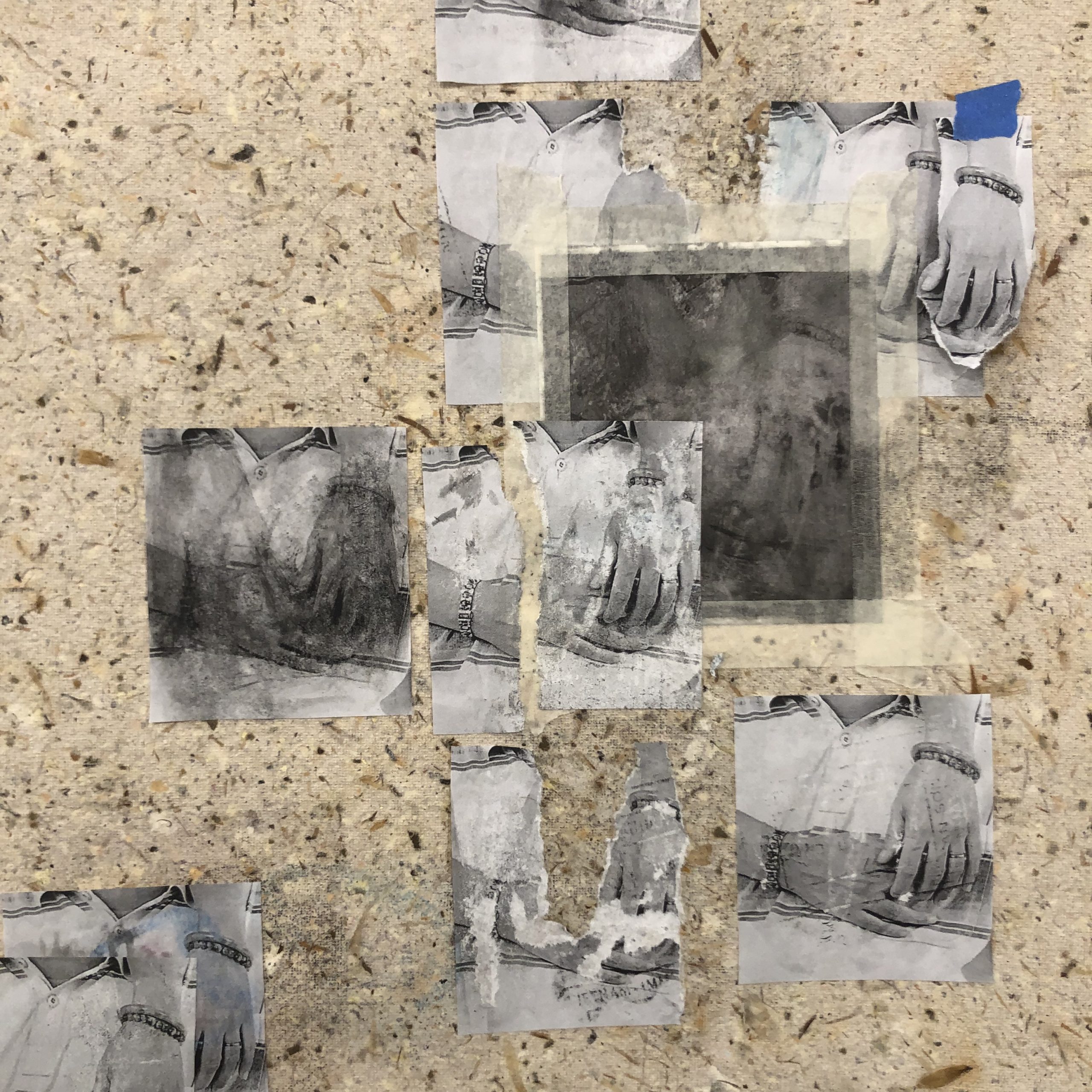
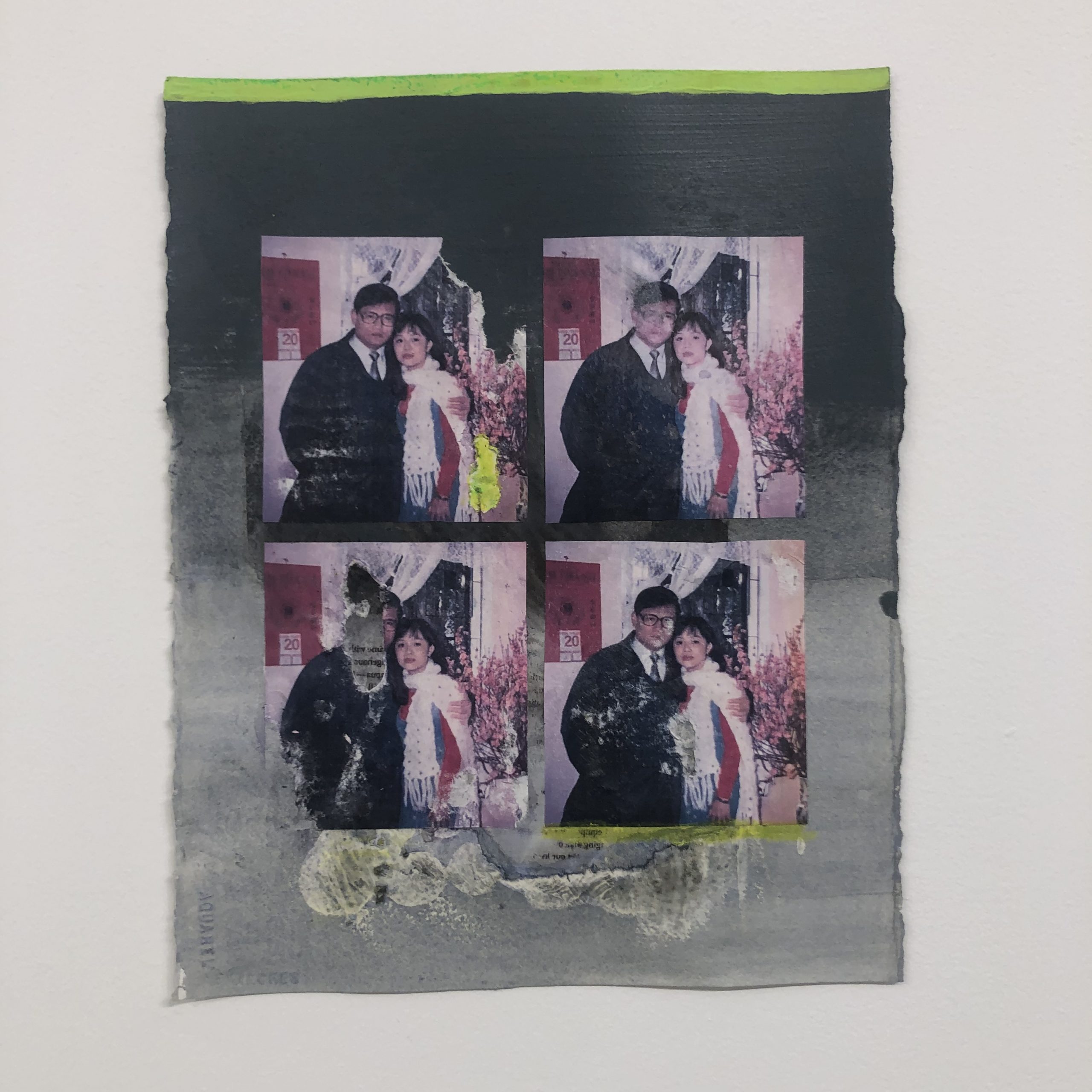
In the artist talk, there was also mention of the reproduction of various specific family photographs. In some works, those reproductions are worn and battered, then glued and taped over handmade paper, which is also made of various past imagery and documents. This layering of both materials and meaning invites close and slow looking as viewers search for clues to this narrative.
Genie Hien Tran, “Touch”
This work is deeply personal and lends itself to reflecting on one’s own family, memories, loss, and reconstruction. The artist’s keen eye for color, shape, and repetition keeps viewers engaged and looking for more.
Genie Hien Tran, “Charteuse (to hold)”
Disclosure: I first me Genie Hien Tran from my time in the MCAD MFA program, and we have published a conversation together on Art Sprawl.
At the opening reception for Less is Enough by Zoe Cinel at Second Shift Studio, I spent some time reflecting on the following works. This exhibition is on view May 17-June 12, 2023 at 1128 Payne Ave, St Paul, MN 55106.
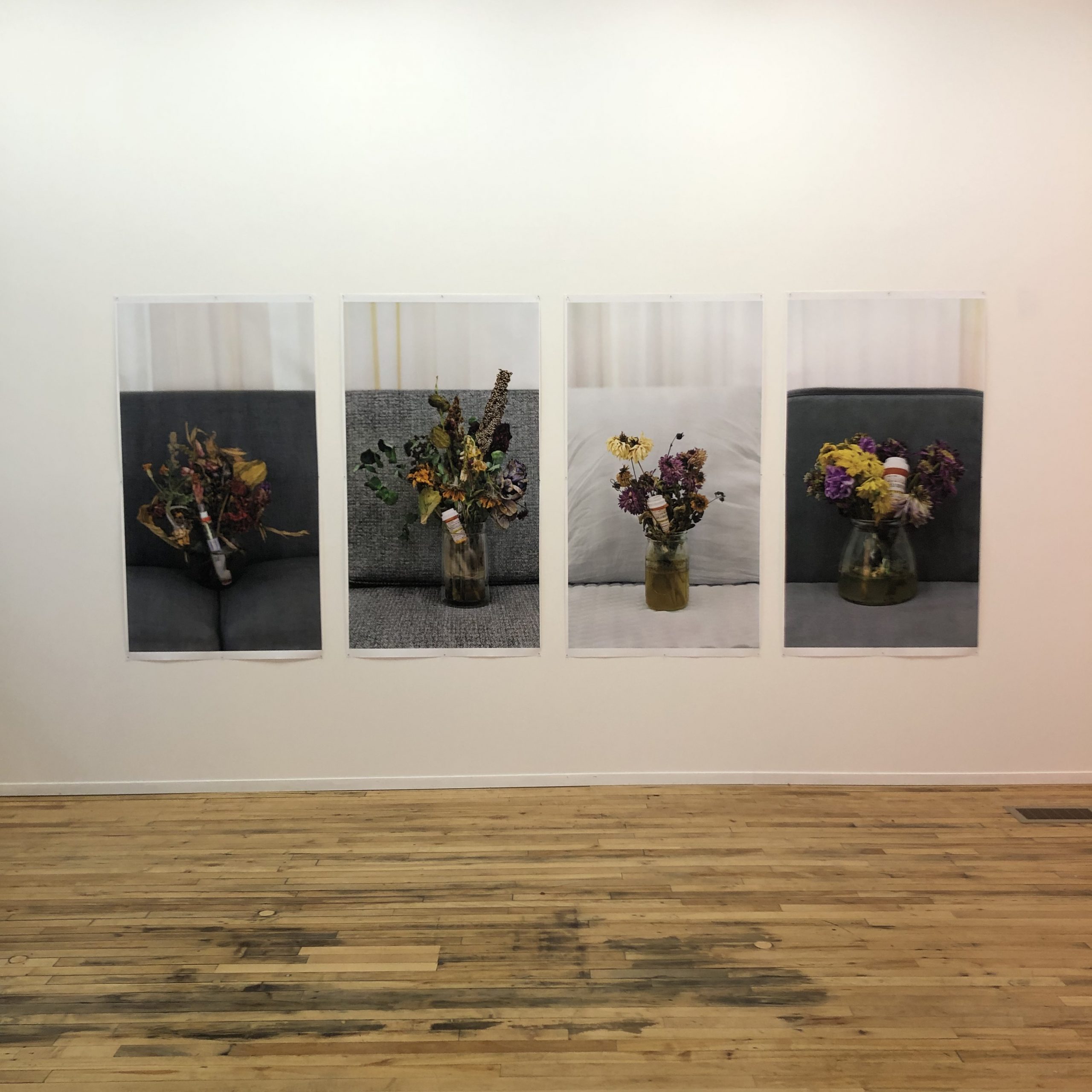
Zoe Cinel, “Nature Mora Series” (2022) Epson banner prints, 58×32″ each
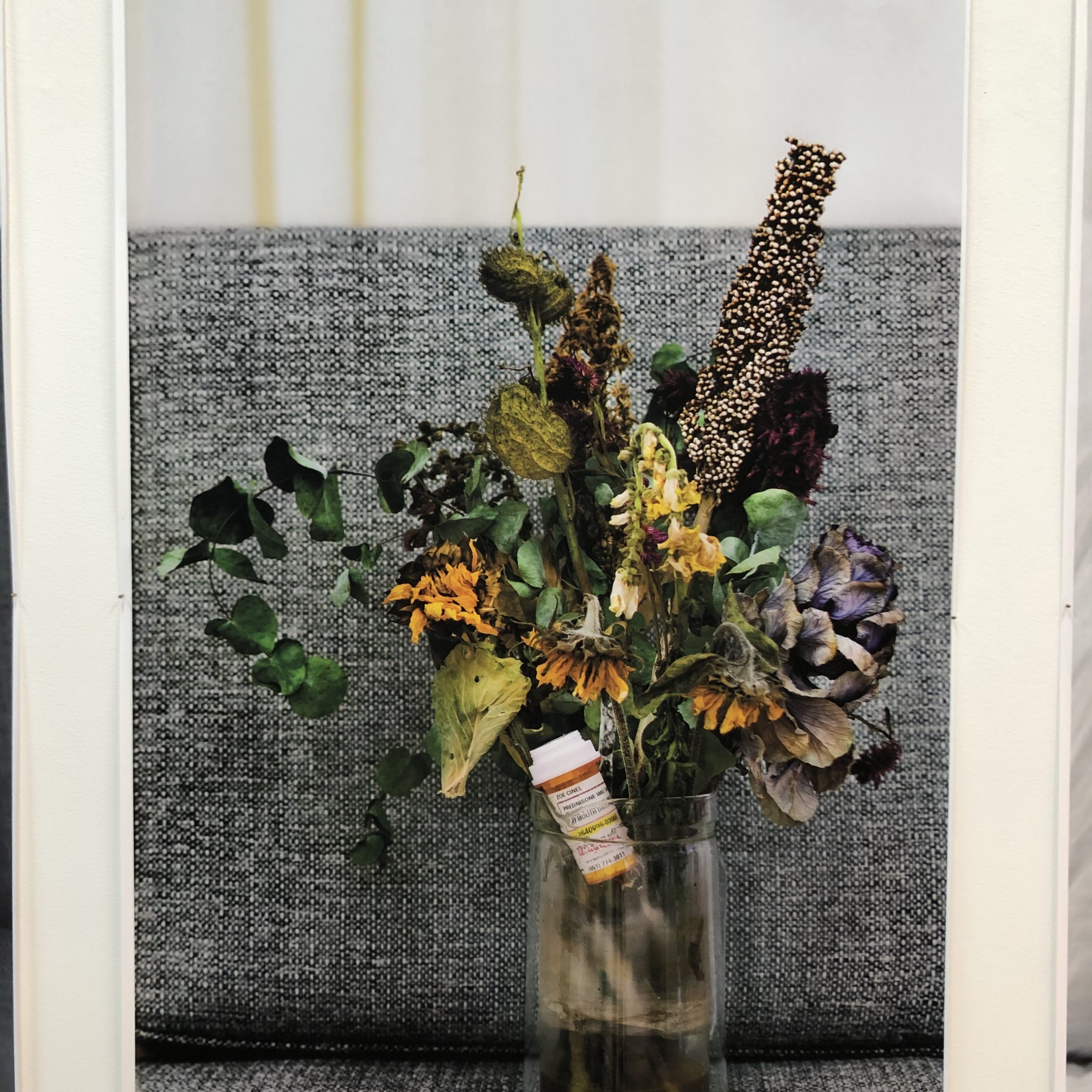
Cinel asks viewers to slow down, look closely, and think deeply about “chronic illness, care, and softness from an individual and communal point of view” (via written material at exhibition). The photos above feature dying bouquets of flowers with various prescription medicine bottles wedged among the stems. The images piqued my curiosity with small clues as to who these belong to (Cinel) and what they might be for (some of the medicine names are visible), while leaving space for broad interpretations to illness generally.
There’s a vulnerability in sharing this often hidden information so publicly. Illness and disability are not well respected in American society, despite the fact that all people move in and out of disability throughout their lives. Sharing and uplifting discussion of this topic helps de-stigmatize people living with all sorts of illnesses and disabilities. The scale and detail of the Natura Morta photographs draws in viewers for that closer consideration.
Zoe Cinel, “Rest with Me” (2023) repurposed hospital mattresses, donated fabric and pillow stuffing, cyanotype prints; variable dimensions
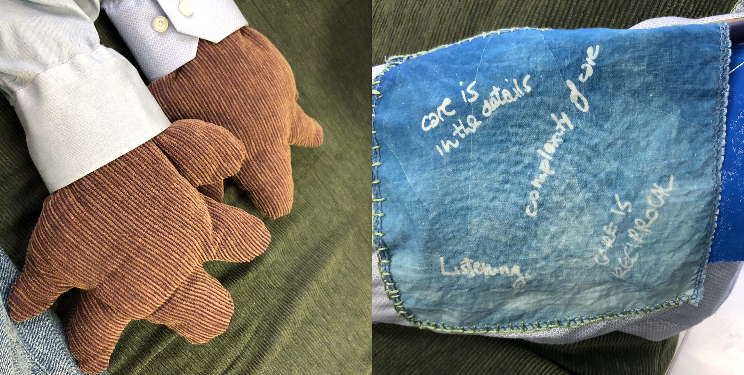
Another piece that drew me in for deeper contemplation (so far in that I neglected to get a full shot of the installation!) was Rest with Me (details pictured here). These stuffed supports reminded me of a cross between a bean-bag chair and a body pillow with arms, which truly does invite softness, lounging, and reflection. The arms are covered in cyanotype patches with written reflections from past discussions on care. The position and placement of this installation invites full-body participation and rest.
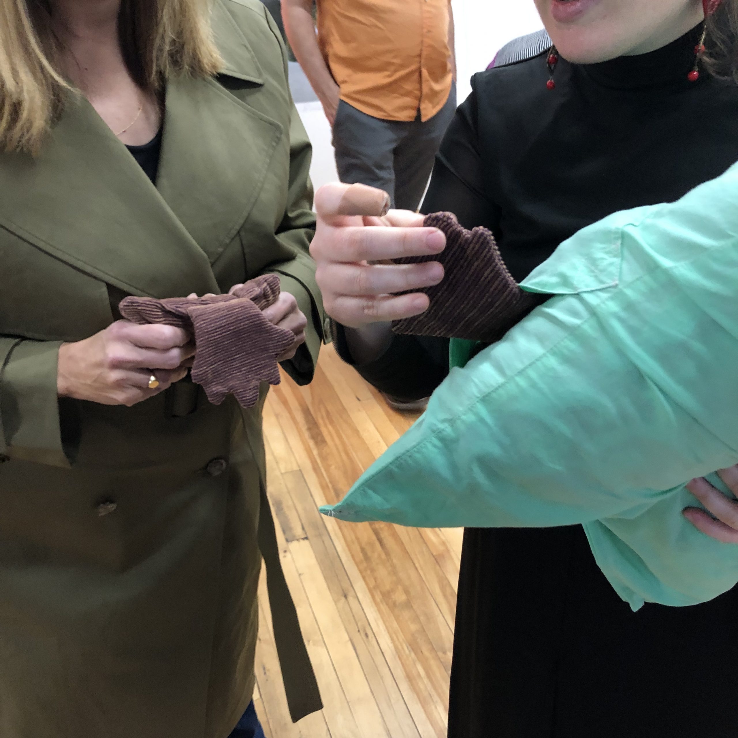
Nearby is Heating Pads, which is strategically placed near a shelf of books for participants to peruse. These heating pads repeat the soft hand forms from Rest with Me and are pictured here. The materials hold sentimental significance to Cinel, but also are an excellent textural choice due to the soft linear details of the corduroy, which invite touching.
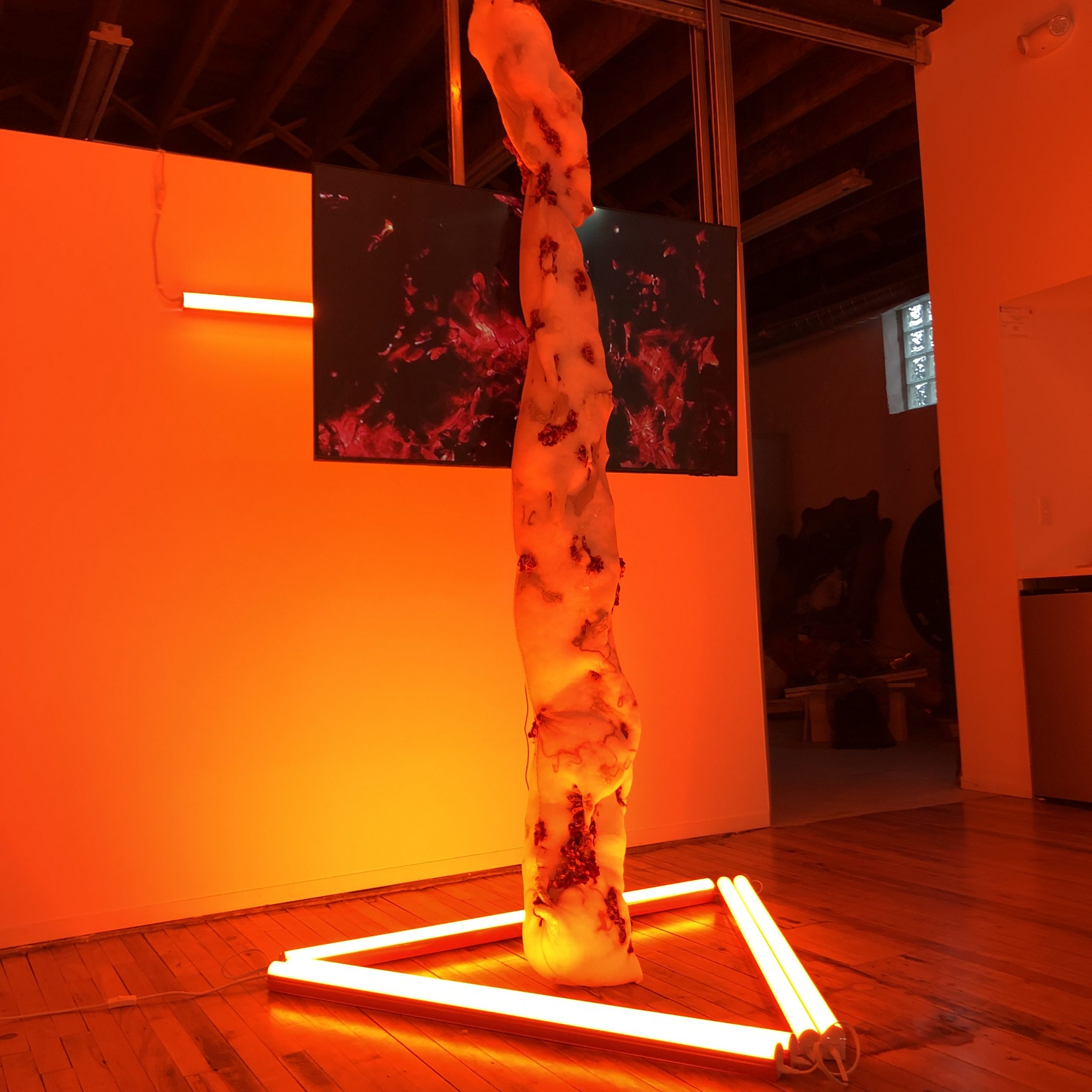
There was an additional video installation, Self-portrait with Flare, which featured a video screen, florescent lights, and sculptural elements. To me, the full transformation of the space of this installation, so different from the rest of the gallery, echoed the moment Cinel found out she was diagnosed with RA (Rheumatoid Arthritis). The shock of color, the towering structure, and the imagery on screen all stops the viewer in their tracks.
Overall, I was struck by the care and vulnerability of this exhibition, and welcomed the invitation to rest, reflect, and pace myself.
Disclosure: I know Zoe Cinel both as an alum of the MCAD MFA program, and as a participant in her “Conversations About Care” discussion group in November 2022.
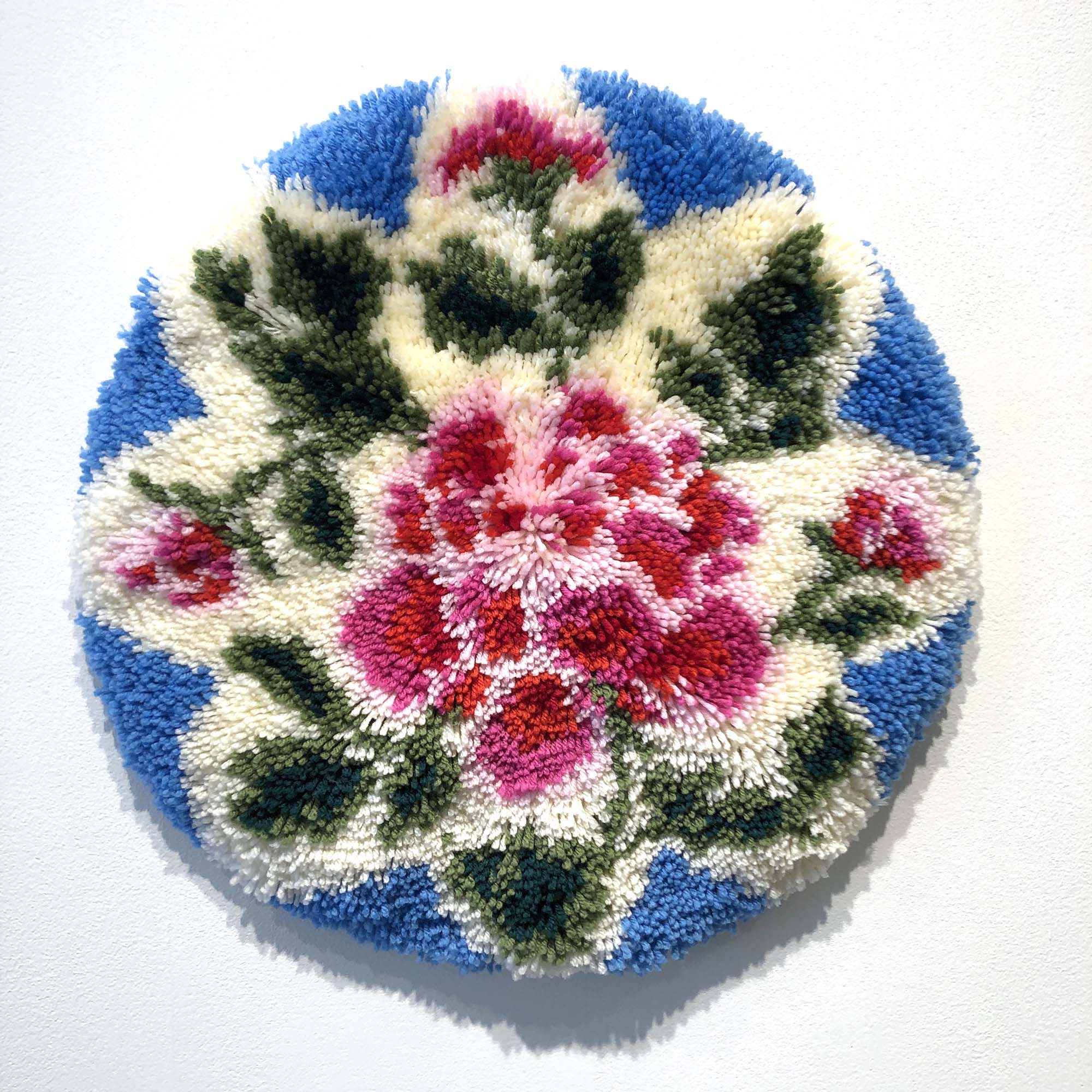
Melissa Borman, “Rose,” 2023, latch hook rug, 20″ diameter x 1.25″ deep
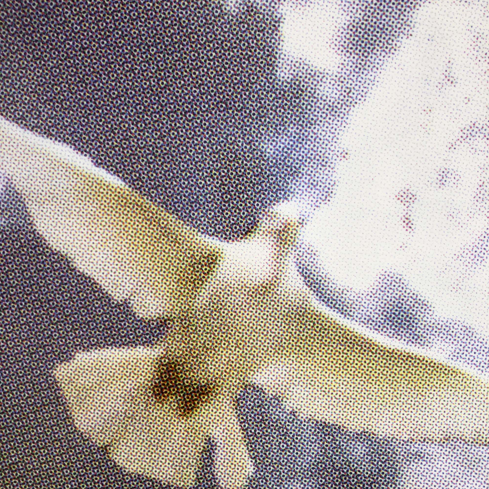
While this exhibition had a clear foundation in photography, I enjoyed the many multimedia pieces, such as this latch hook rug. Like many of the works in this exhibition, Rose projects a sense of nostalgia and memory (I especially felt this in Sanctuary too). Rose also highlights the technical creation of images, and its own latch hook directions are featured in the artist book that accompanies this exhibition. I noticed this emphasis on visual components across multiple works, whether in terms of the enlarged half-tones in Memorial, or in this case, individual pieces of yarn brought together to create a visual whole.
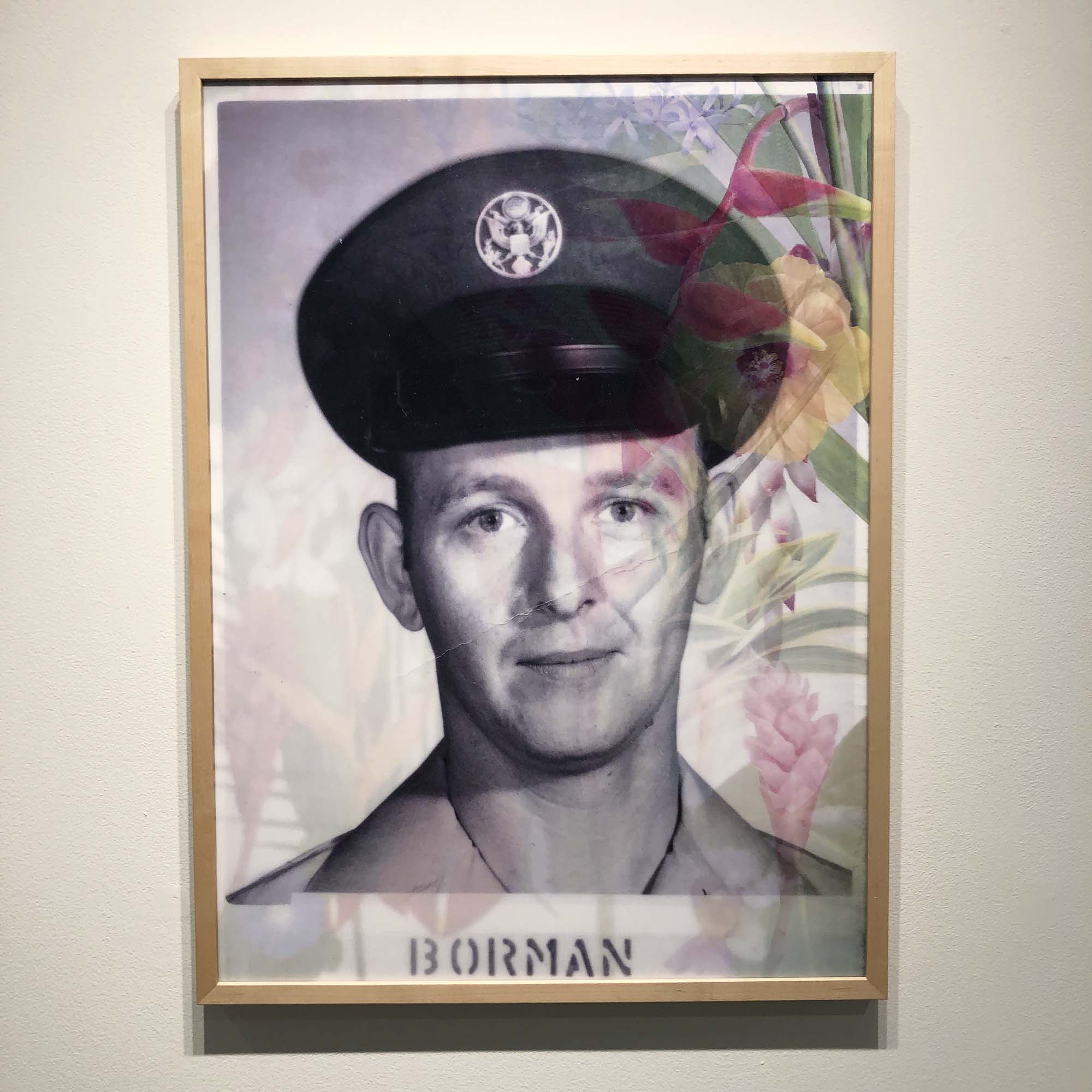
Multiple works connect to ideas of shifting and change. In Troubled Waters, a beautiful grid of images of ocean waves churning, we see the actual tumult of nature, and right next to it, in My Father was a Flower Garden, Borman’s father is featured in a lenticular print that shifts from his military portrait to tropical flowers. As she shares in the exhibition statement, he was a closeted gay man, and this piece seems a beautiful tribute to that challenge.
Melissa Borman, “My Father Was a Flower Garden,” 2023, lenticular print, 32.75″x24″
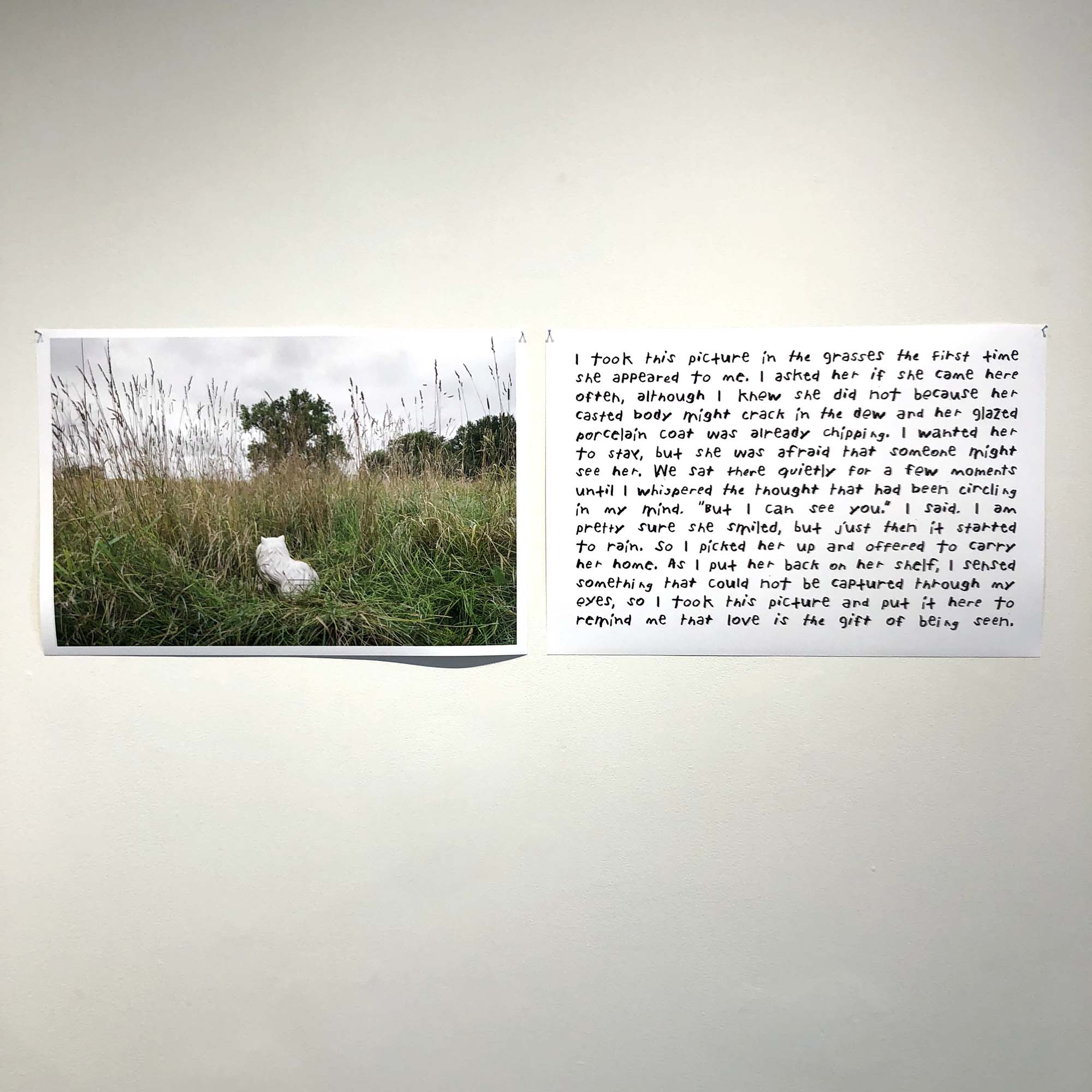
I also enjoyed the collaborative work between Borman and Julie Reneé Benda, The White Cat. This piece features Borman’s photograph of a white cat sculpture in a green field and Benda’s short written reflection about the image, which closes with, “…to remind me that love is the gift of being seen.” It feels like many works in this exhibition hold that same sentiment, especially the small box of snap shots that accompanies The Journal of a Sea Animal Living on Land.
Melissa Borman and Julie Reneé Benda, “The White Cat,” 2023, archival pigment prints, 17″x25.5″
Also on view is a striking artist book with the same title as the exhibition. It features and essay by Sheila Dickinson, and was carefully crafted with several translucent inserts that mimic the qualities of a lenticular print. The reproductions are excellent and the book includes all the works in the exhibition. I highly recommend stopping by gallery hours when you can leisurely spend time with this text and the rest of the work.
Melissa Borman, “[Re]collections & Earthly Artifacts,” 2023, artist book
Disclosure: Melissa Borman and I are both members of Title Collective.
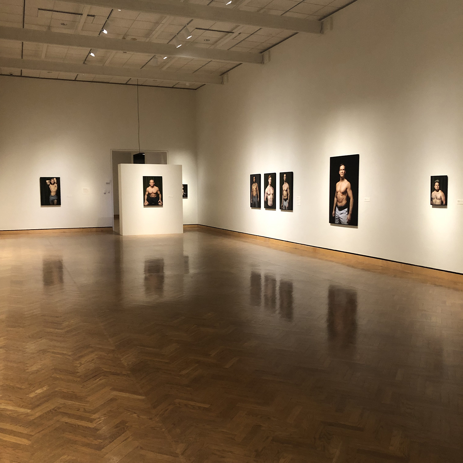
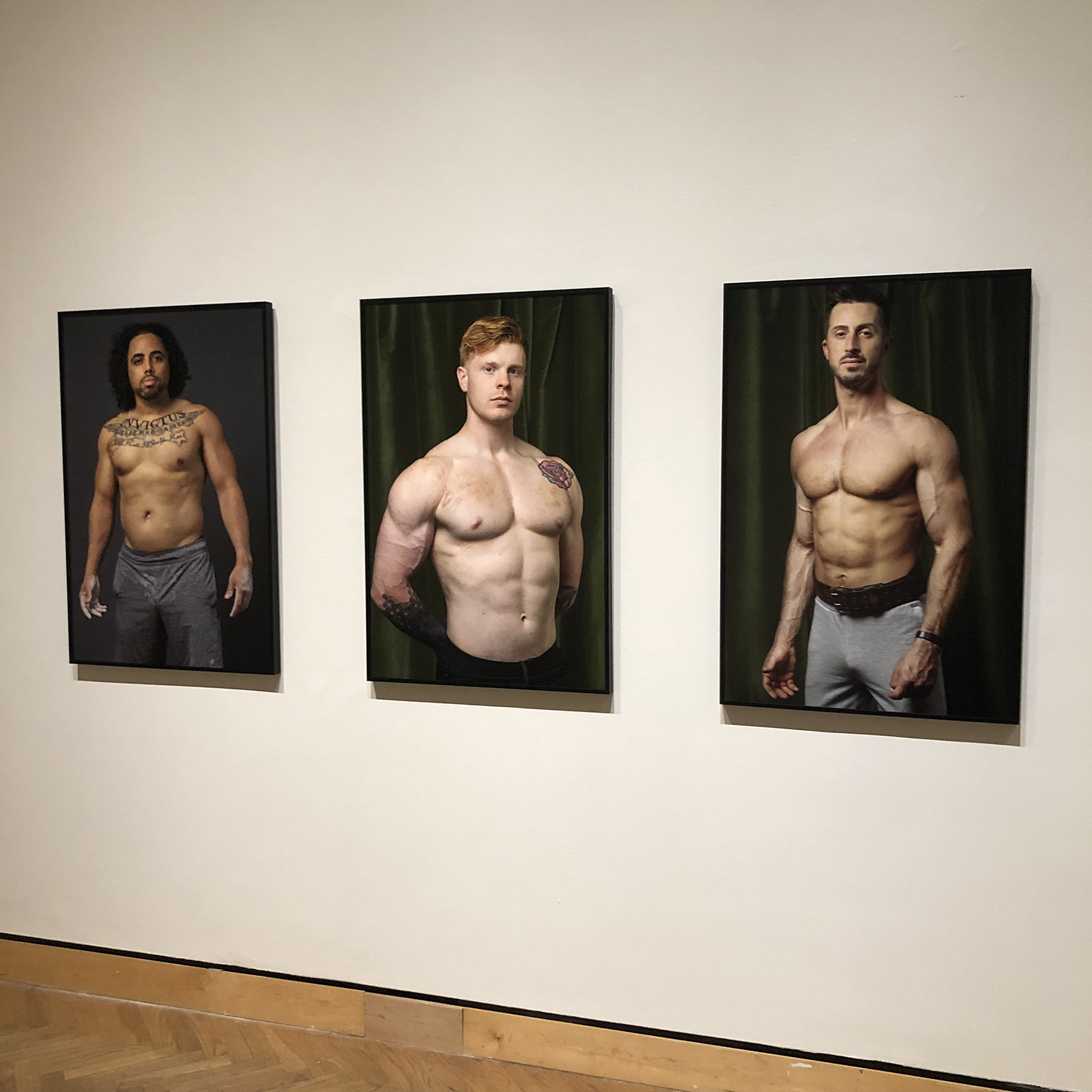
I stopped by Body//Weight by Christopher Selleck at Mia to check out the photographs, video work, and interactive mirrored installation (on view through June 25, 2023 at 2400 Third Ave S, Minneapolis 55404). As the exhibition text suggests, this show highlights “the nature of masculinity within society” using the subject matter of men who engage in weightlifting.
Christopher Selleck, Body//Weight
The U.S. Bank Gallery which houses the Minnesota Artists Exhibition Program (MAEP) has a specific two-room layout, and it’s always interesting to see how different artists tackle this architectural challenge. In Selleck’s case, he placed all of the video and installation work in the first room, which seemed like a smart move for setting a tone before entering the larger section of the gallery housing most of the photography work.
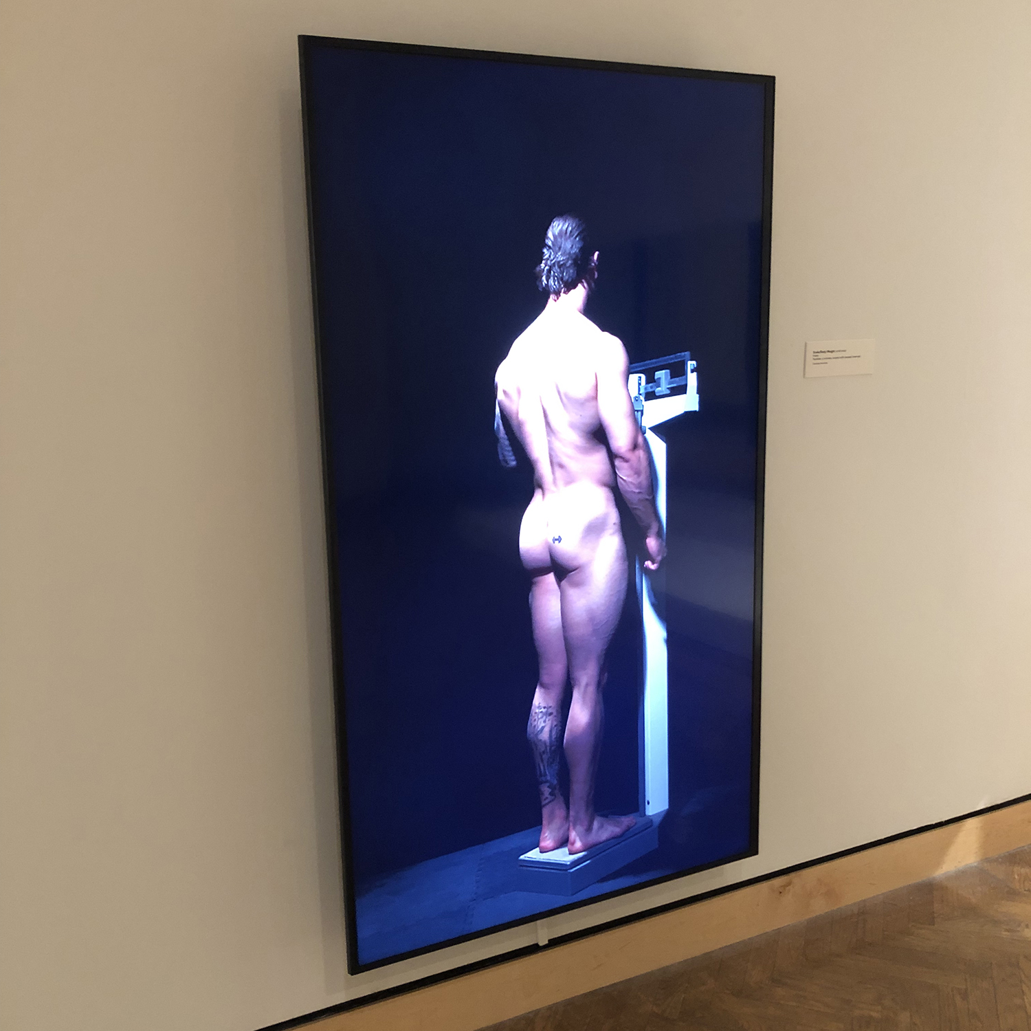
Christopher Selleck, Scale/Body Weight, 2018-2022, video, 4:00 minutes
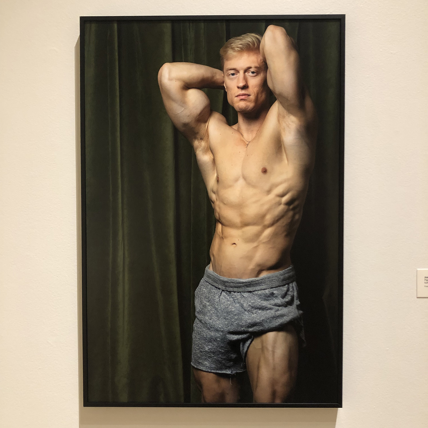
The video works are relatively short and repetitive, setting up brief meditative moments to consider concepts of self-regulation of weight. The videos are formally beautiful and might remind one of Bill Viola in their vertical framing and focus on singular figures and specific gestures.
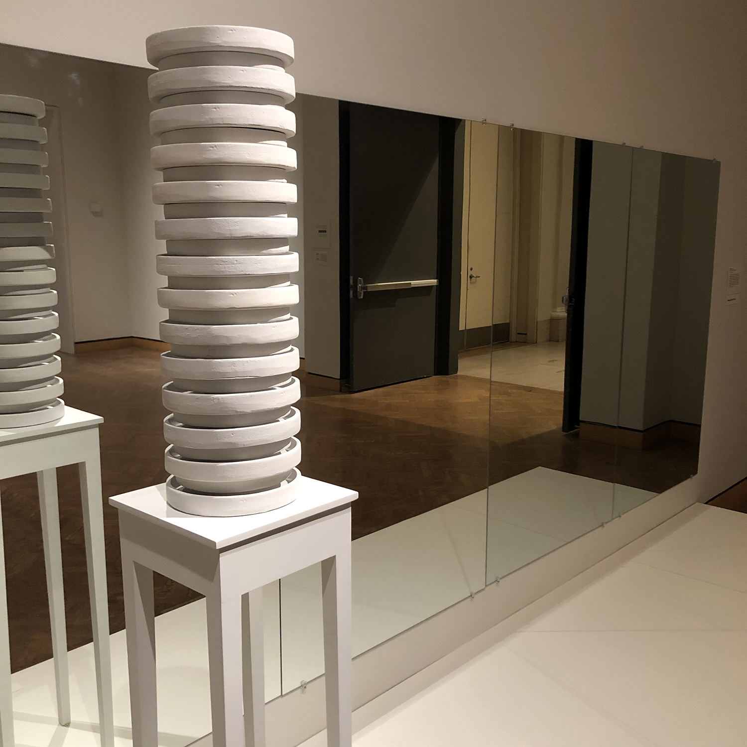
Christopher Selleck, 5’10″/#205, 2019, cast plaster on custom pedestal
The mirrored installation includes a tall slender stack of cast plaster weights on a tiny table, heightening the viewer’s self-awareness and inviting contemplation of the artist’s mention of body dysmorphia, “a disconnection between the real and imagined self.” I found it particularly poignant when one is alone in the gallery.
Christopher Selleck, Joey (2020), Kolton (2021), Adam M. (2022), pigmented ink print mounted to Dibond with luster laminate
As I passed from the small room into the larger one, I appreciated the careful curation of images into pairs, trios, and single works for consideration. Having just passed through the first room contemplating issues of self-perception, weight control, and ideas of body sculpting, I found myself closely examining facial expressions and chosen poses. Selleck mentions he works collaboratively with his models. Voyeurism, masculinity, and vulnerability all stirred together as I walked from image to image thinking about each person making choices about how to look into the camera and position their bodies.
Christopher Selleck, Josh, 2022, pigmented ink print mounted to Dibond with luster laminate
The time investment of weightlifting as a practice was front of mind, as well as the passage of time and how bodies are constantly in a state of flux. The futility of efforts towards controlling our bodies was clear as each image feels like a person captured for just a moment in a process of striving, whether it’s for themselves, or the approval of others.
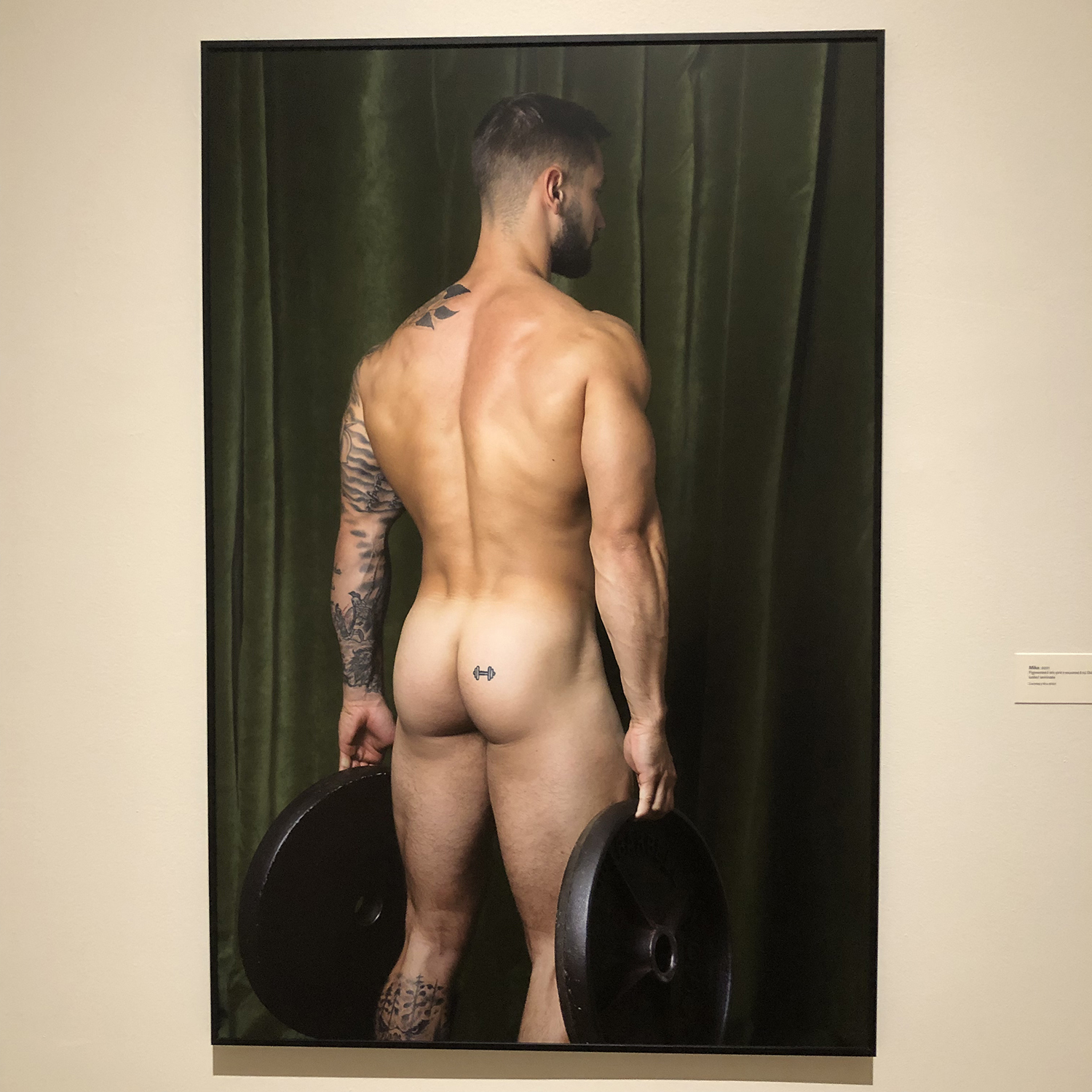
Christopher Selleck, Mike, 2021, pigmented ink print mounted to Dibond with luster laminate
There were also several works that felt like specifically formal studies of societal standards of beauty with the figures turned away from the camera, and the full focus on the musculature and lighting. Small indicators of individuality were present, often through tattoos. I’m limiting the images I share here to encourage people to go visit the exhibition themselves, as there are many more works to check out.
Disclosure: I first met Christopher Selleck in 2018 as an alum of the MFA program at MCAD.
Night Club Gallery
340 WABASHA ST. N. ST. PAUL, MN 55102
Hours: Fri-Sun, 1-5pm
Julia Garcia, “Bloom” 2023, acrylic and ink on canvas, 38″x38″
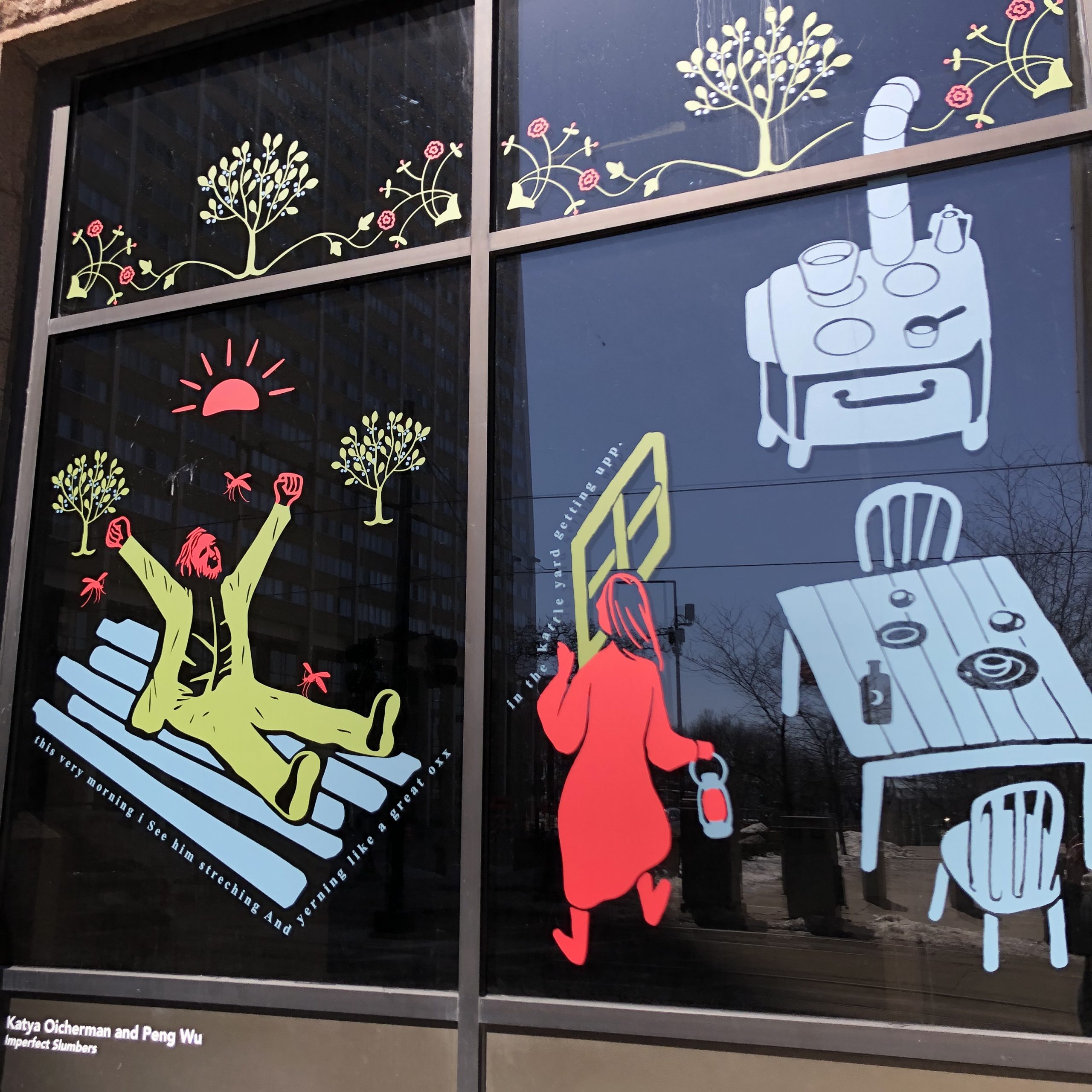
This was my first time at Night Club Gallery at their new St. Paul location for Julia Garcia’s new exhibition, SAWGRASS, and I was delighted to find it’s within easy walking distance of Lowertown Underground Artists, where I took in Zach Leonard’s show, Awkward Oddities. The fun bonus was as I walked from LUA to Night Club, I passed Im/Perfect Slumbers in the windows of The M and Jose Dominguez’s work in skyway!
I would recommend this trek to anyone, and if you do it this coming weekend, you can still catch all 3 (Zach Leonard’s show is open this coming Saturday, March 25 for 10am-2pm or 6-8pm for a closing reception).
Katya Oicherman and Peng Wu, “Imperfect Slumbers” at The M windows
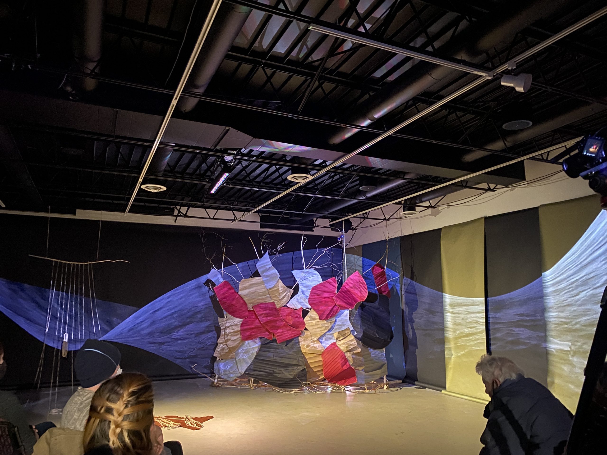
Rosy Simas Danse, “she who lives on the road to war” (2022) at All My Relations Arts. Photo Credit: Alondra M. Garza
AG: How did you feel throughout the experience? Emotionally and/or physically.
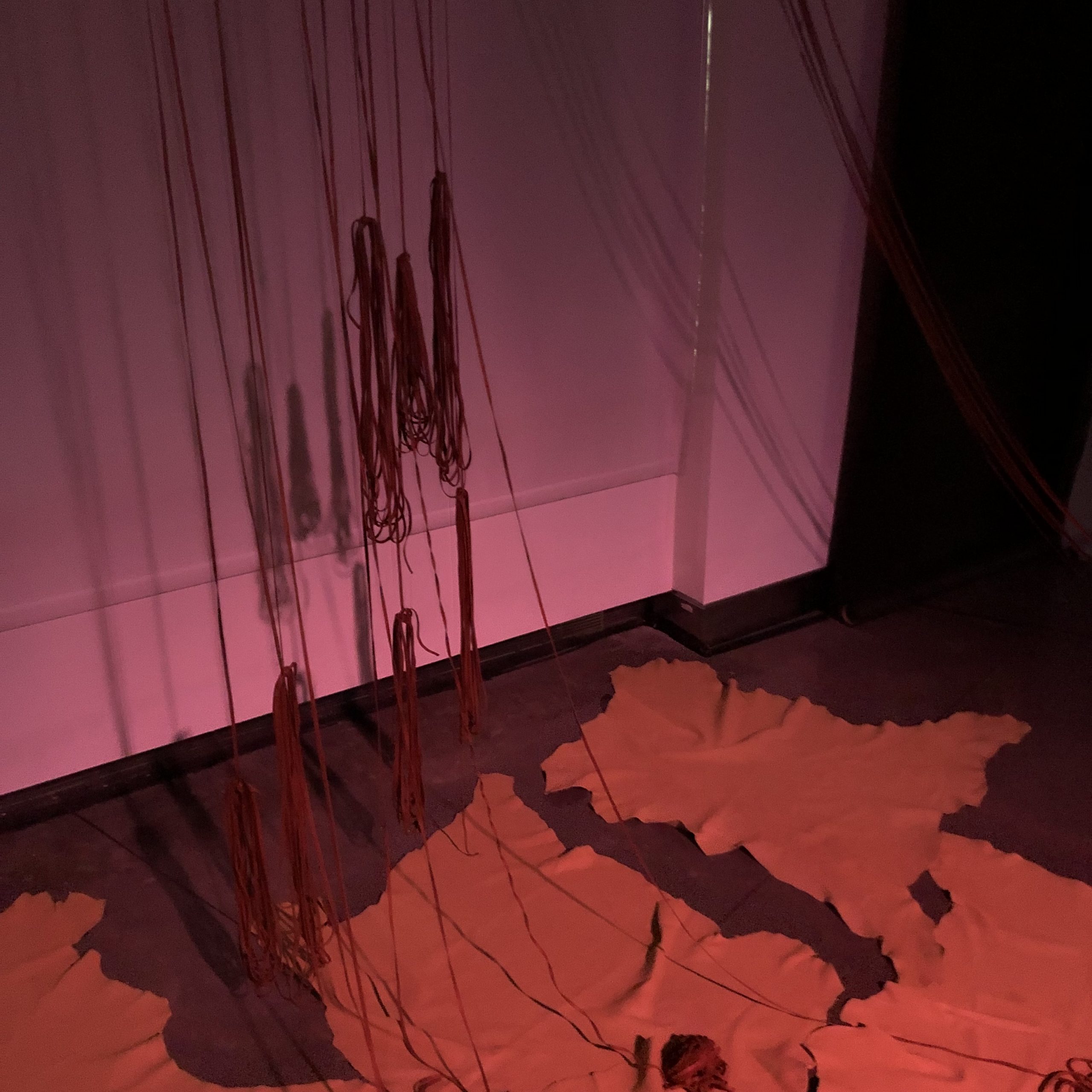
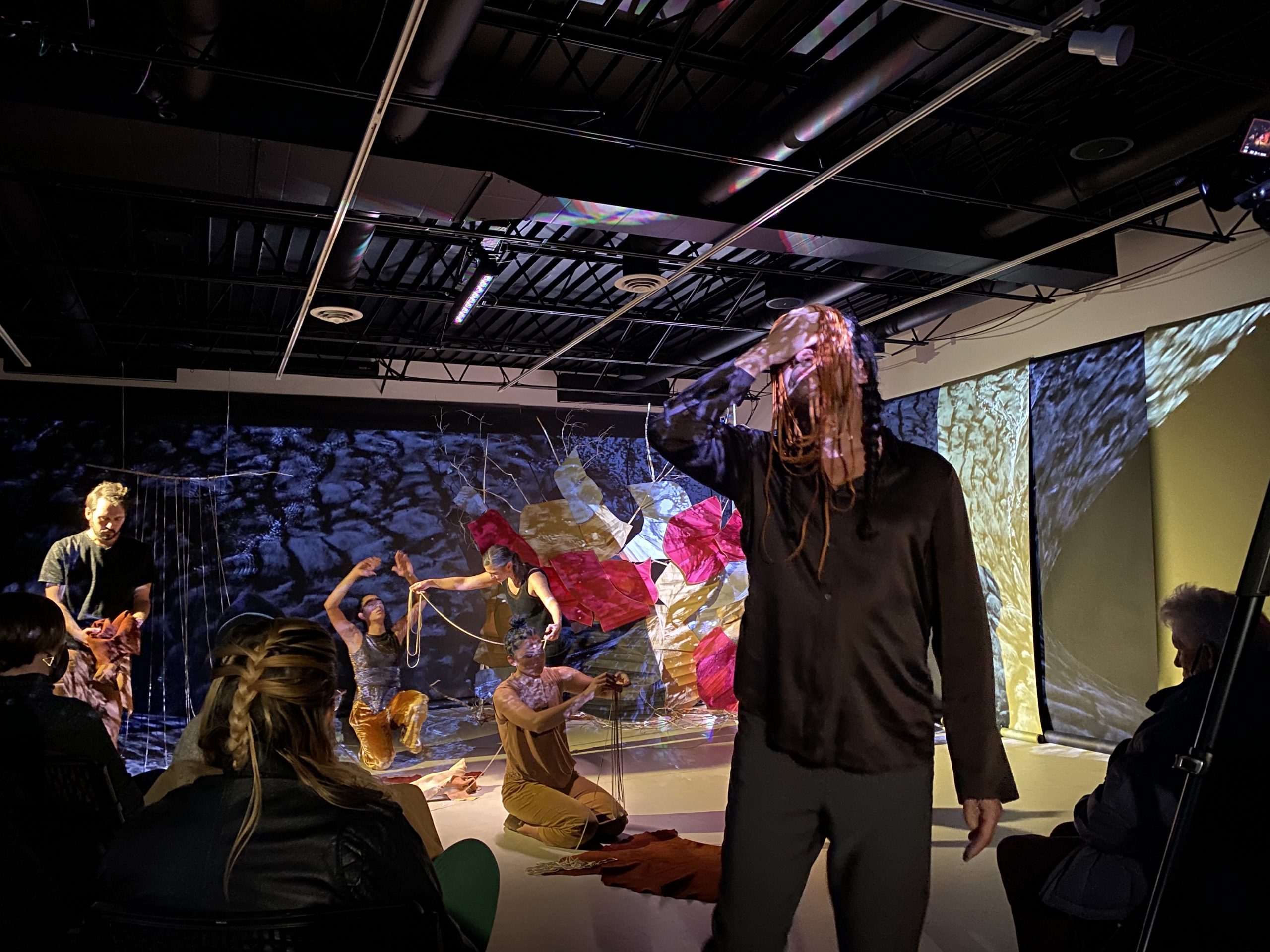
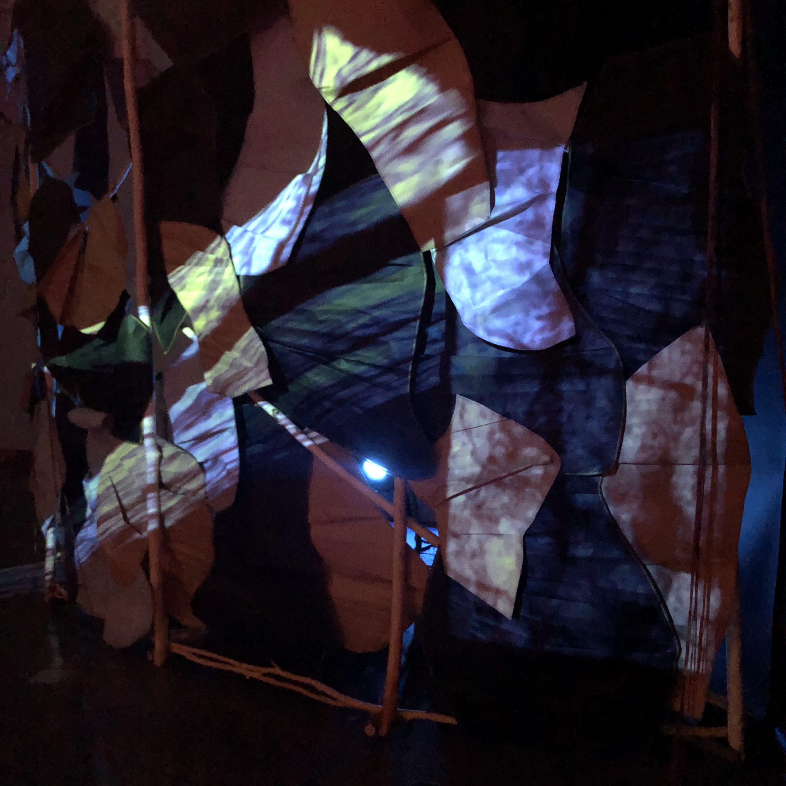
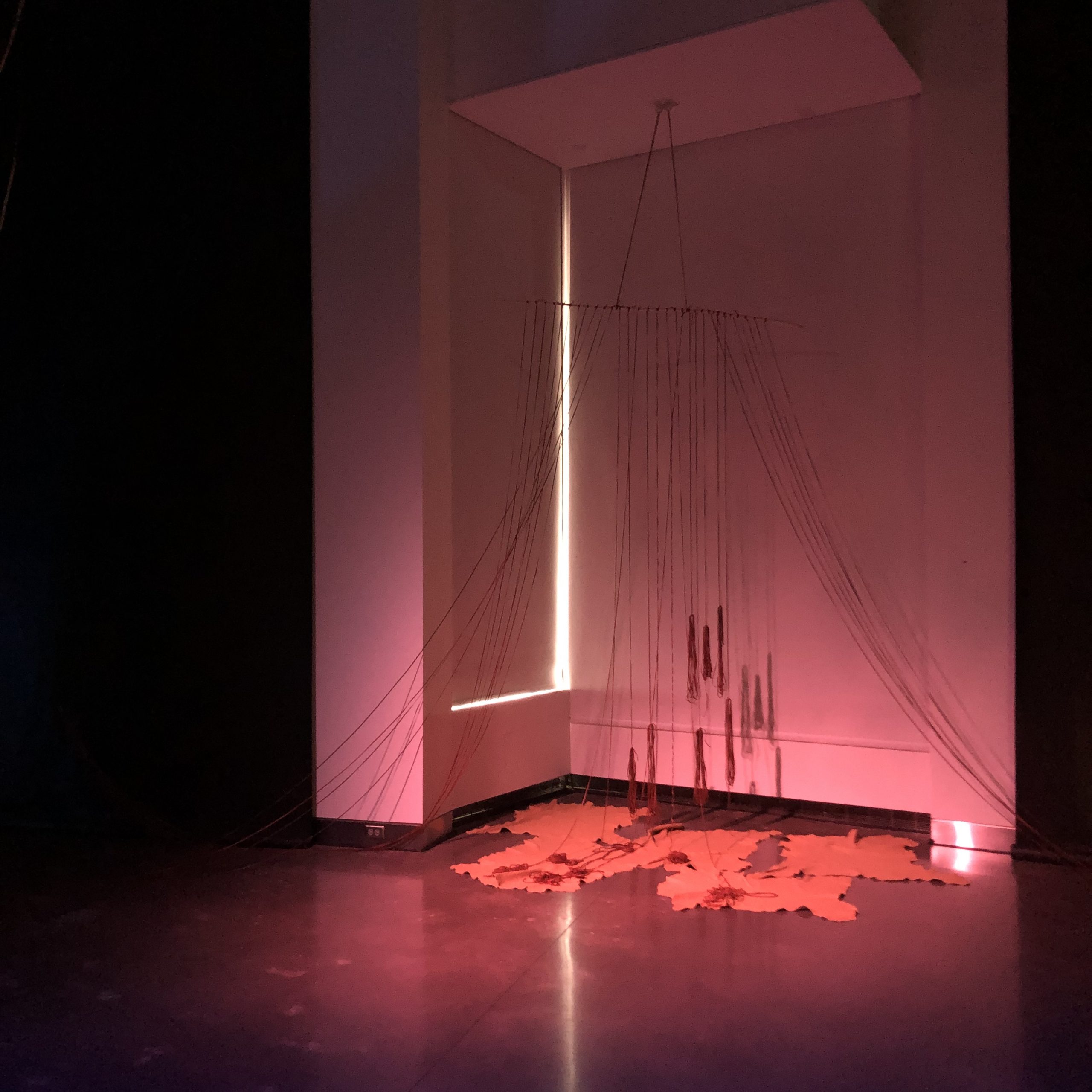
EM: I felt contemplative throughout much of the performance because there was a lot to look at throughout the space as the performers moved in relation to each other and the objects in the space, such as leather hides and long leather laces. I was also curious to watch the interactions with the audience unfold, especially with the leather laces handed out around the room.
Rosy Simas Danse, “she who lives on the road to war” (2022) at Weisman Art Museum. Photo Credit: Ellen Mueller
AG: Was there a special moment or movement of the artists that caught your attention or immersed you in the experience?
EM: It caught my attention when I noticed one performer’s movement influencing another person’s movement and so on. Those physical echoes across the space felt directly connected to the themes that were named, such as gathering, resting, and grieving. I also thought the performers’ responses to the soundscape were well improvised, helping to tie together the visual and audio components with the movement elements.
Rosy Simas Danse, “she who lives on the road to war” (2022) at All My Relations Arts. Photo Credit: Alondra M. Garza
AG: Did you understand the message of the performance? If so, what helped you understand? the body movements, the sound, or the video?
EM: I read the project description before arriving, so I had some of those conceptual themes in my head. I felt like the sound and video did a lot to support the transitions and phases of the movement throughout. The performers responded to the shifts in sound and video helping the experience feel like a cohesive whole, while preserving specific moments of interest throughout. The entire experience invited slow looking and attention to detail.
Rosy Simas Danse, “she who lives on the road to war” (2022) at Wiesman Art Museum. Photo Credit: Ellen Mueller
EM: This performance took place at multiple venues – where did you see the experience and how did that context and the arrangement of space affect you?
AG: I saw the performance at All My Relations Gallery. The space was arranged in a way that the dancers came out from the back and walked into a hallway to get to the main stage where the installation was. People could sit in the hallway area as well, and that is where I was sitting. I got to see the dancers next to me while they were walking into the space. That made me feel integrated as part of the performance since some of the projections were pointing at me as well. The people sitting in front of the stage area had to look back and see the dancers walking through that hallway, and they saw that they were next to me. I not only felt a part of it because of that but mainly because I feel at home at that gallery and can relate to the Indigenous message of the performance since I am part Indigenous of the Americas. It was definitely more impactful to me to have seen it at that gallery as well, as I noticed some of the public were Indigenous as well and the staff there are Indigenous.
Rosy Simas Danse, “she who lives on the road to war” (2022) at Wiesman Art Museum. Photo Credit: Ellen Mueller
EM: I would also like to ask you about your understanding of the performance – what were the key elements for you and what was most impactful?
AG: Using the nature sounds, the sticks, and the leather that is all part of our ancestral land was beautiful. Those were the main tools used, as well as the body language. All these elements together had an impact on me, as to understand our connection to this land. The way that their bodies were interacting with each other also made me think of our connection to other indigenous and non-indigenous people and how nature connects us as well. Their body language indicated meditation, grief, love, and energy. After reading the statement about the performance, I thought it was great that they focused on how the dancers were connected to Rosy Simas’s studio in their own artistic ways, and that was something great to hear about at the after-talk that I stayed for. I thought it added to the richness of how we connect to one another outside of the performance.
Overall, this was a very thoughtful performance and an immersive experience where I felt so many emotions that transported me into nature and connection. Fantastic!
—
Disclosure: I know Alondra M. Garza from when I was directing the MFA program at MCAD.
ALEXANDRA BEAUMONT, “Dancing with Friends 1 – 3” (2022) Various textiles
EM: The details felt like a really key element that ties this group exhibition together, whether that was specific moments in paintings, mindful choices in object construction, or repeated items in collage/assemblage works, etc. what were some of the most striking details to you and why?
PATRICIO DELARA, Figure study on post-it (2022)
AS: For me some of the most striking details were revealed in the shifts of scale between the pieces. Beaumont’s monumental figures danced next to Delara’s study of figures on a post it note, further reducing Delara’s figures within their pastel piece (on view next to the post it). This juxtaposition of a seemingly small detail of a post it note study used something of a very small scale, tacked like a note to the wall, to draw me in closely. Upon turning around and viewing Beaumont’s dancing figures, I had to first step back to take in the details, but then also step forward to understand the various textiles and stitches. This rhythm of stepping closely and stepping back was necessary to unlock the details within the exhibition. Other details that struck me through this process were saleh’s structural wood element and the hard objects embedded within Taman’s piece.
EM: As the curatorial statement shares, memories and landscape are central to this exhibition, and I know memory has been a key part of your creative practice too. I wonder if there were specific pieces that resonated based on use of memory?
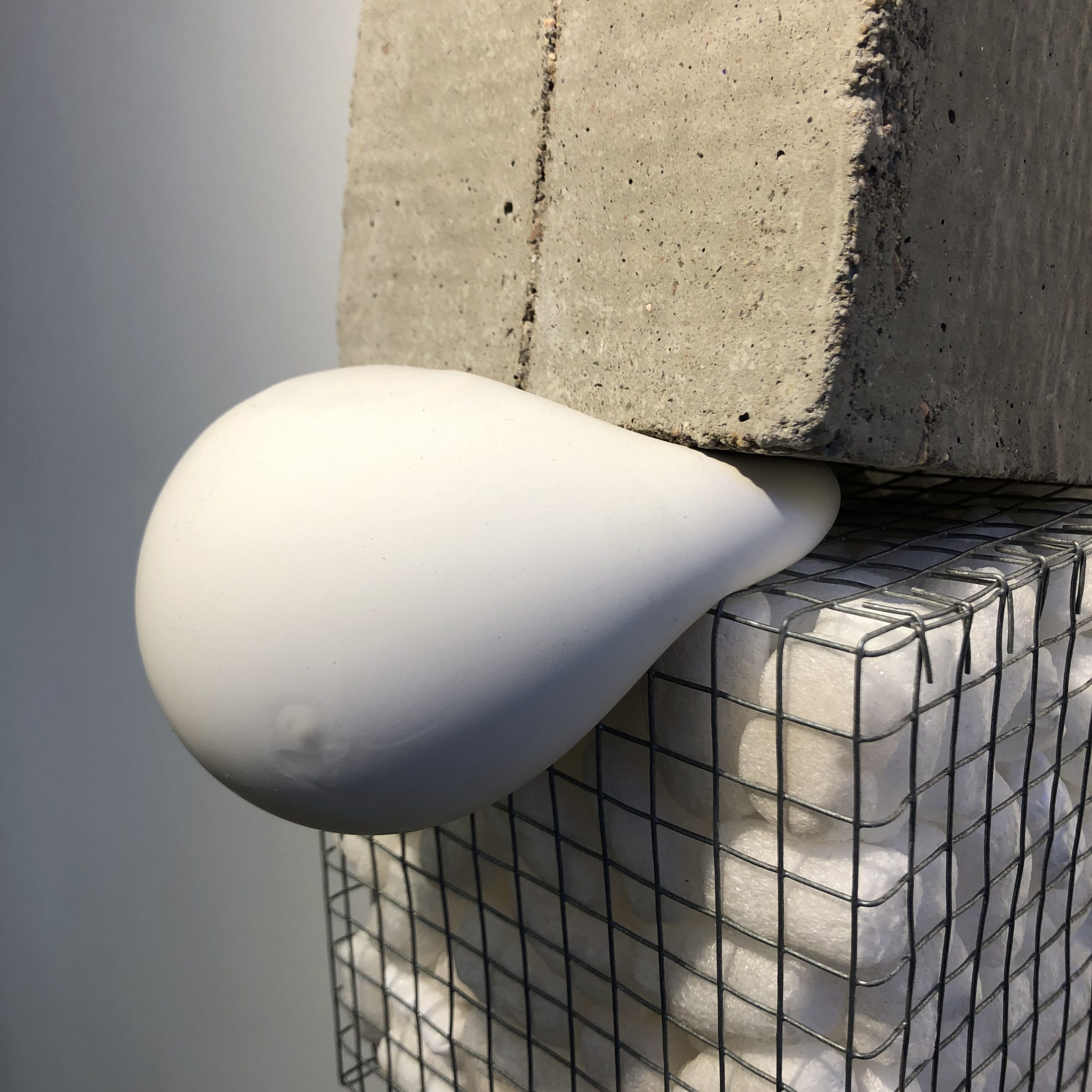
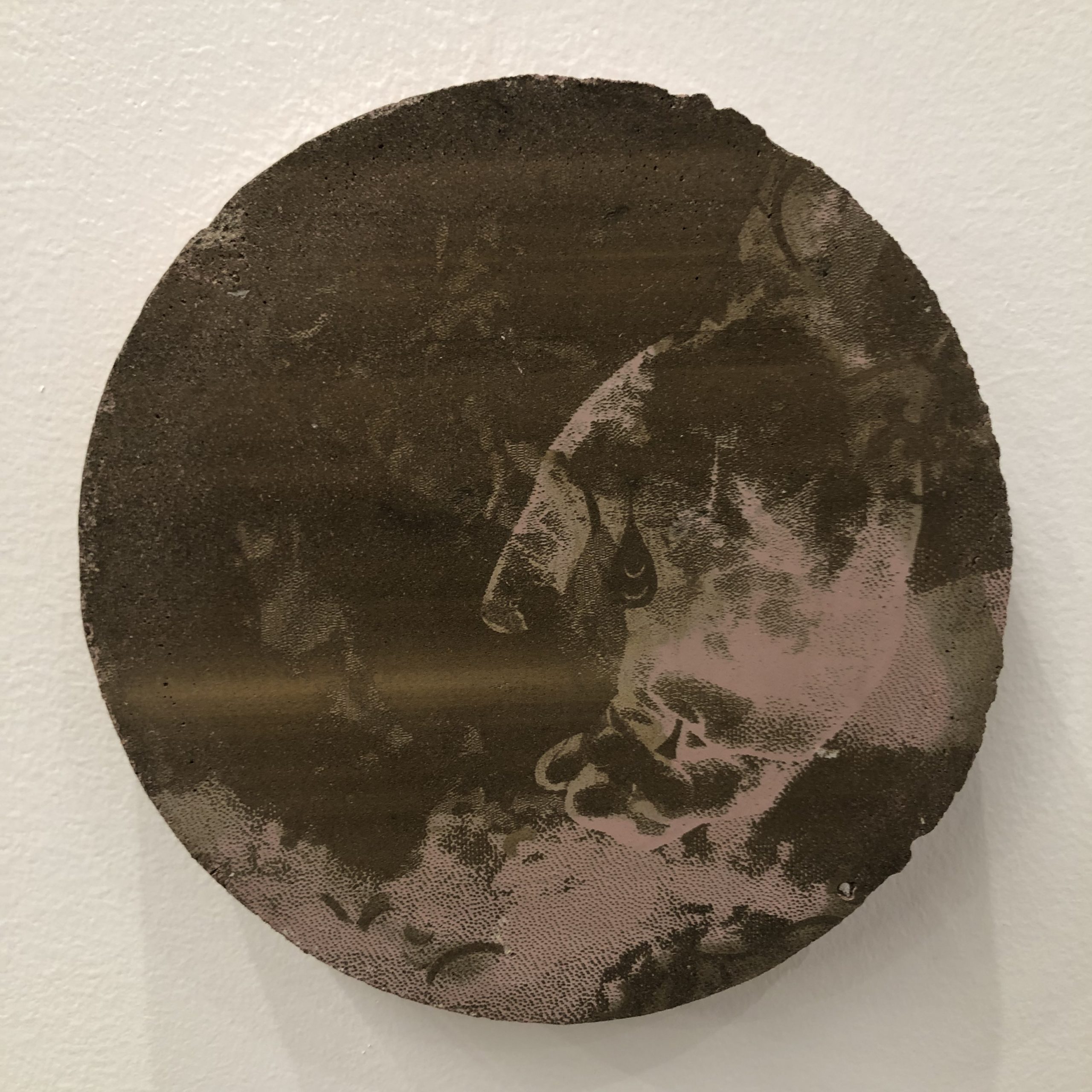
AS: Taman’s Teata’s Tabletent and Varghese Mac’sA series of forms to keep our skin intact both especially resonated with me. Taman’s piece, for me, beautifully displays how objects hold memories and can be put away and not thought about but also a stagnant presence in our memories. Like my own work, Taman has recreated this handed down object to explore their own identity in connection to ancestral lineage. Varghese Mac’s piece mirrored how both personal and societal memory functions. Concrete, something initially flexible and changing, can solidify to serve a specific purpose. Our memories also transform and adapt to fit purposeful narratives to understand ourselves. Varghese Mac’s etched images on the concrete are subtle and eroded enough to feel like a deep cultural memory, seeming to suggest how solid concrete will one day crumble following the cycle of memory.
SATYA VARGHESE MAC, “A series of forms to keep our skin intact” (2022) Light etched concrete, iron and titanium oxides, mustard seed oil
EM: Texture was an important formal component across several works, whether is the juicy piled painted borders of Maiya Lea Hartman’s painting, the hanging layered fiber work of Alexandra Beaumont, or the etched concrete of Satya Varghese Mac, among many others. Where did texture stand out? Or was there a different key formal element to you?
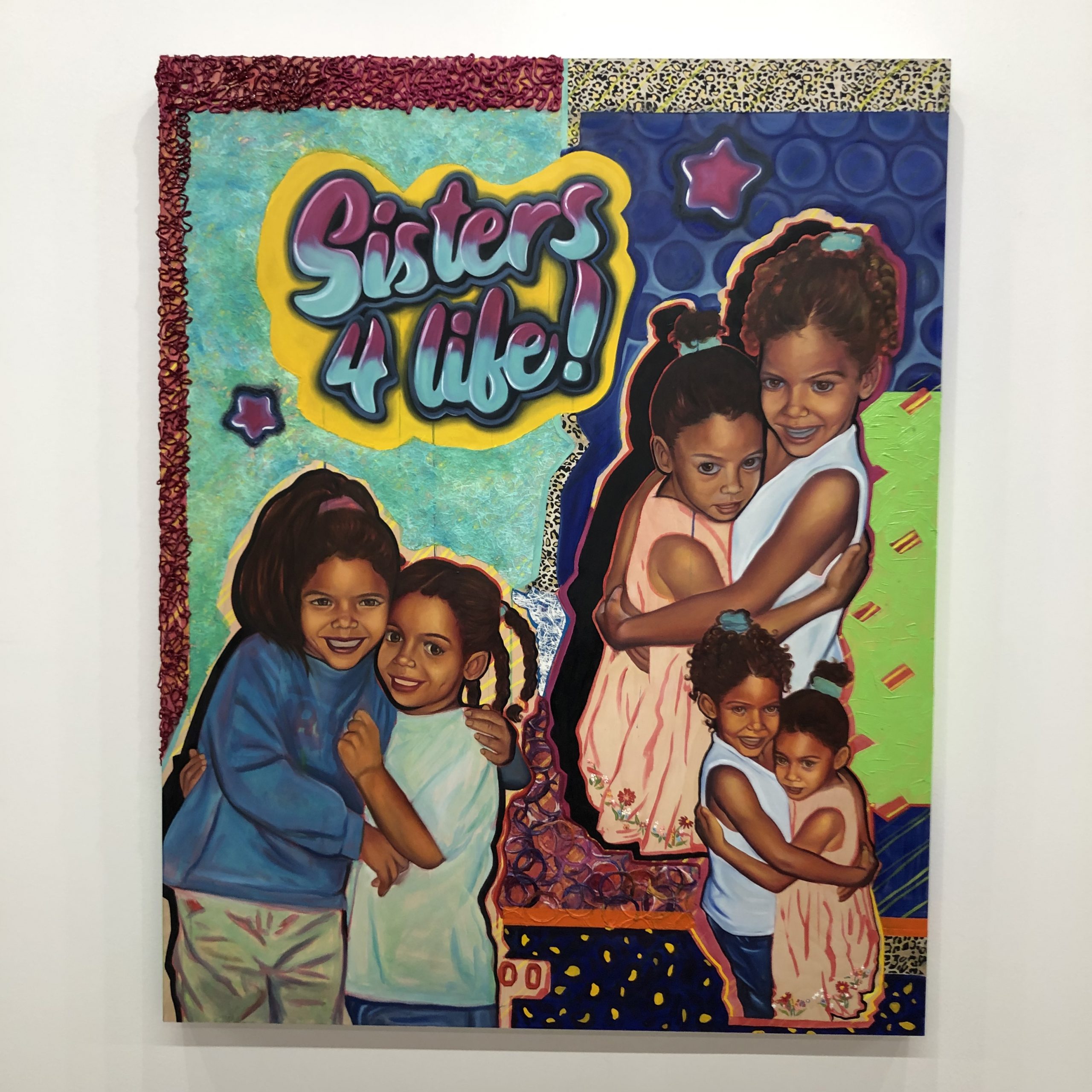
MAIYA LEA HARTMAN, “Sisters 4 Life” (2022) Acrylic, oil, paper on wood pane
AS: Within the exhibition, texture stood out in the woven layered collage like elements of many of the pieces. This served to give the exhibition an overall texture. Many of the pieces seemed to be fitting parts together as a whole and this element served to bring all of the pieces in the exhibition together, whole. Ford’sThe Beginning of it All, is a painting rich in surface pattern which brings a textural element into the painting. The painting canvas itself seemed raw and was forced into the frame, embracing wrinkles in the canvas adding an unexpected textural element. Khuth’s photographic collages, Small Ruptures, paired smoothness of skin and a silky blue backdrop with textural wrinkles of fabric and jewelry which emitted the feeling of warm metal on skin. This pairing in the collage reflected many of the textural variations of the exhibition.
SABRINA FORD, “The Beginning of it All” (2022) Acrylic, oil pastel on canvas
MICHAEL KHUTH, “Small Ruptures” (2022) Paper, tape
Disclosure: I know Anika Schneider from when I was directing the MFA program at MCAD.
Teo Nguyễn, “Phan Thị Kim Phúc” (2018) Acrylic on vellum, mounted to aluminum
EM: When and how to provide context seemed like a question the artist made careful decisions about. I wondered what you thought about what was and was not provided?
GHT: Talking about the paintings specifically, I think the majority of them don’t provide much of what their sources are, such as the original photographs and other researched materials. They only provide the artist’s perspectives. This to me is interesting. Growing up Vietnamese, I refer to the war as “The American War” and it is of course the opposite here. The difference is a matter of perspective, the point of view of who the speaker is. I believe that by stripping away context, the artist is revealing to us his point of view instead of what was provided to him. Nguyen is choosing to see what he would like to see; and in his words, it is worthiness, beauty, reconciliation, resistance and spiritualism. On the other hand, the artist purposefully chooses to reveal the source such as “The Terror of War” photograph for one of his paintings. By doing this, he’s emphasizing the story of the girl in the photo, Kim Phúc, who most often referred to as the Napalm girl. In the didactic, he gives space to show her hope, her fight and commitment to live. Through her story, I believe Nguyen finds the power of resistance.
Also, even though I understand that the paintings must have been of real places and regions in Vietnam, there are no indications of street name, town, village and land marker that would lead me to a specific location. Without such information, you as the audience are trusted to view the work solely through the artist’s point of view—through his colors, language, and brush strokes, etc. Even without reading the artist’s statement, one could sense peacefulness, and at the same time, sorrow and mourning through the paintings very effectively.
Teo Nguyễn, “Agent Orange” (2022) archival aqueous pigment prints on transparent film; acrylic
EM: The scale shifts in this exhibition are significant, from tiny and large-scale photorealistic paintings, to the video work, to the huge installations hanging in the atrium or installed on the floor. I see similar scale shifts in your own practice, with tiny images and collaged moments arranged within much larger fields or picture planes. I wondered if you had any thoughts on the use of scale?
GHT: I know I mentioned this in the question I posed for you, but this exhibition makes me think a lot about the body. I think it has something to do with the constant overlaps of what is and isn’t seen, shown or provided. From the paintings which have war and human evidence deliberately removed to the floor paper installation of dead and missing Vietnamese people, this exhibition is empty of bodies. Contrasting that with the different scales of the work, which I feel require the viewers to compose their body differently depending on the piece: slouching down and peering into his mother’s intimate poetry, or tilting their heads back to look at the ceiling installation. I’m not sure entirely what this shift in movement means to me, but I find that it’s interesting to actively move yourself around and activate many senses in order to be immersed in an exhibition that is mostly of missing and lost bodies. I also think it almost goes back to the idea of forced perspective, of point of view. With the many different scales, the artist is making us ask questions of: Why is this scene at this scale? Where do I stand to experience the piece? What do I miss and gain from my way of seeing?
The scale shift in my own work is different in my opinion. I think Nguyen sees each of his paintings or pieces as a totality, while I think my images are part of one another. When I shift the scale of an image, it is because they either become more or less visible to me in the moment, and are completely dependent on its relationship with other images. However, sometimes I structure my images and their scales entirely based on technicality or spiritual reasons. If a scale or composition makes me feel good, I’ll work with that and won’t impose too much thinking behind it.
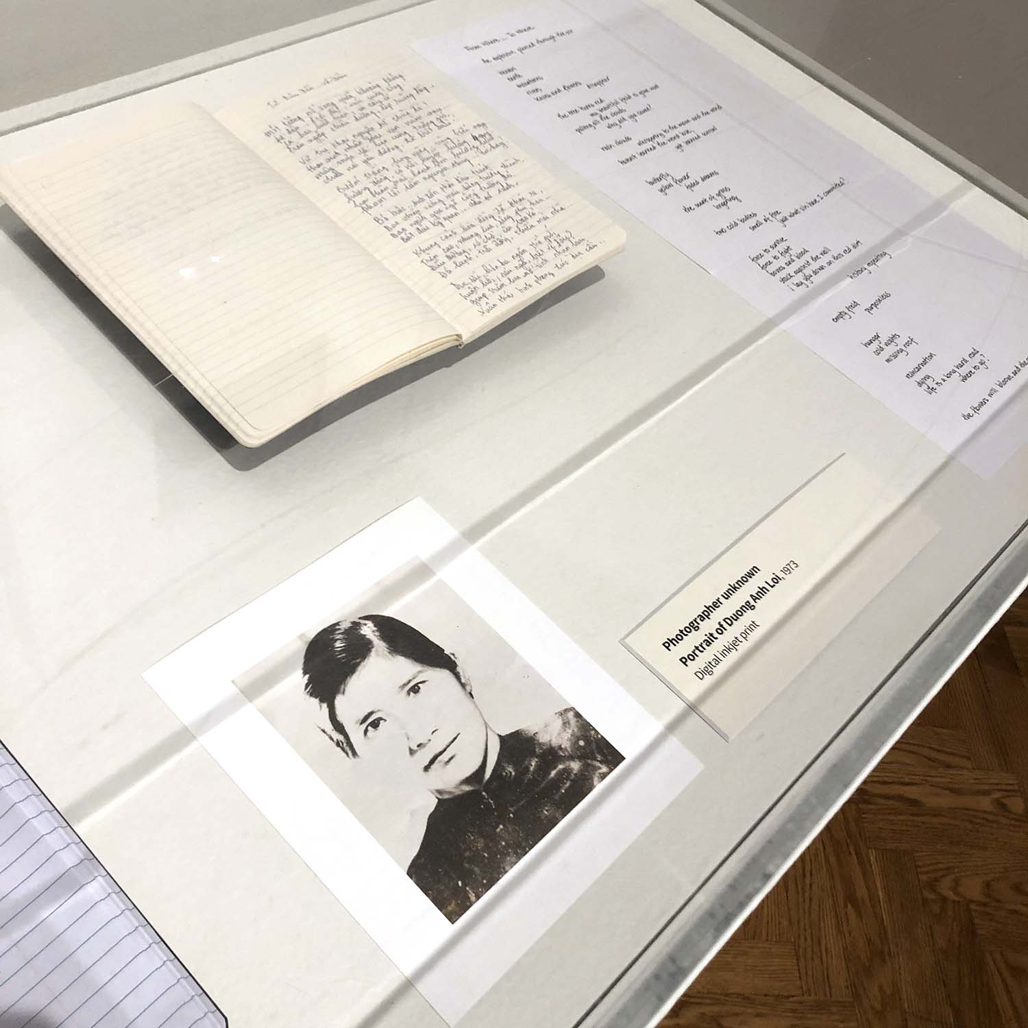
Poetry and photo in display case in Teo Nguyễn exhibition; photographer unknown for Portrait of Duang Anh Loi (1973), digital inkjet print
EM: Point of view, memory, and familial relationships are important to the conceptual underpinnings of these works, from the photojournalist’s perspective to the artist’s mother’s reflections. Did anything related to point of view stand out to you?
GHT: Feel like I touched on that a little with the other answers. There definitely is a strong undertone and influence of memory and familial relationship alongside his point of view. In the video and poetic piece, we see a much more personal take at the war and how it affected the artist’s familial relationship. These are one of the only few pieces in the show with presentations of a person, and both are of his mother (or echoes of her image, language, etc.). With both, we get this sense of loss and separation that are a lot more obvious and pungent. Accompanied with no dialogues, the song in the video piece reminded me of a lullaby a mom would sing to her young child. The melody also lingers with you when you are reading the artist’s mother’s writing due to the pieces being next to each other. To me, the memory of the artist’s mother and his familial relationships feel like a cornerstone, a grounded starting point in order for him to venture to other viewpoints.
Teo Nguyễn, “We Never Met, Yet Our Souls Embrace, Yêu Nhau Trong Phận Người ” (2018) acrylic on vellum, mounted to aluminum
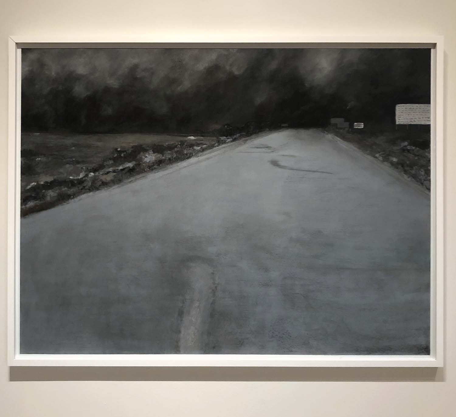
GHT: When approaching the topics of war and human trauma, the artist deliberately removes human depiction and historical evidence and yet, to me, it seems that the land somehow remembers the pain. How does the mere appearance of land and environment make you feel as the audience? What do you think of the idea of land storing memories and if you have anything more to add to that?
EM: The painted landscapes are beautiful on their own and the absence of the horrors of war make that beauty all the more poignant to me because it underlines the total unnecessary-ness of that violence. The space thrived before the war, and while the land will continue to hold memories of the violence via depressions and clearings in the brush, it will also slowly return to these pre-war states. I believe the time it takes to heal the land, letting plant and animal life do the slow work of mending, is a long-term reminder of the harm done.
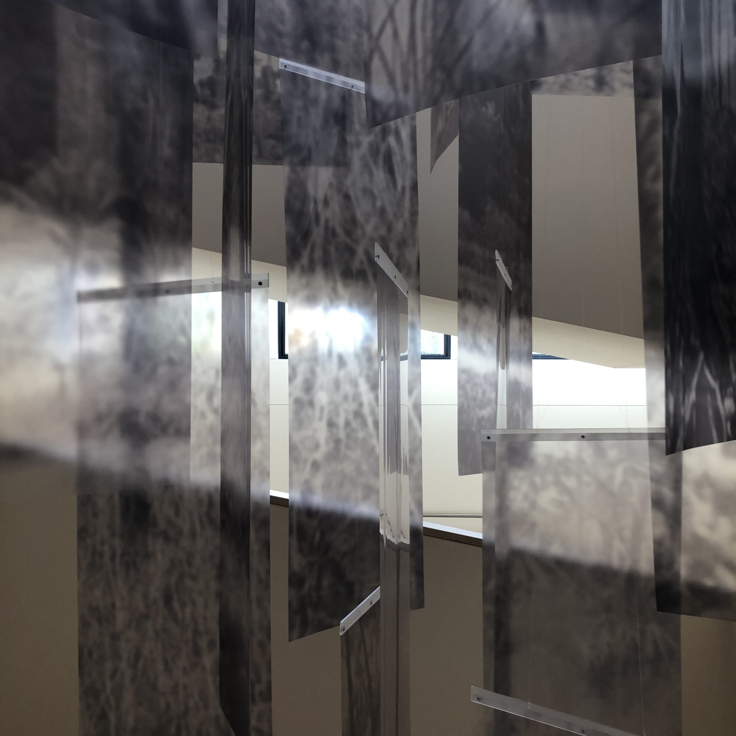
Teo Nguyễn, Remembering Other (2022) stacked white paper; transparent acrylic; site-specific installation
GHT: As you mentioned, the work ranges from 2-dimensional drawings to video work and ceiling installation. Though they might be different in format and scale, in each piece, there is an implication of the body—not only of the dead and wounded but also of the artist. I wonder if you thought of this as well and what are your thoughts on the hidden bodies behind the work?
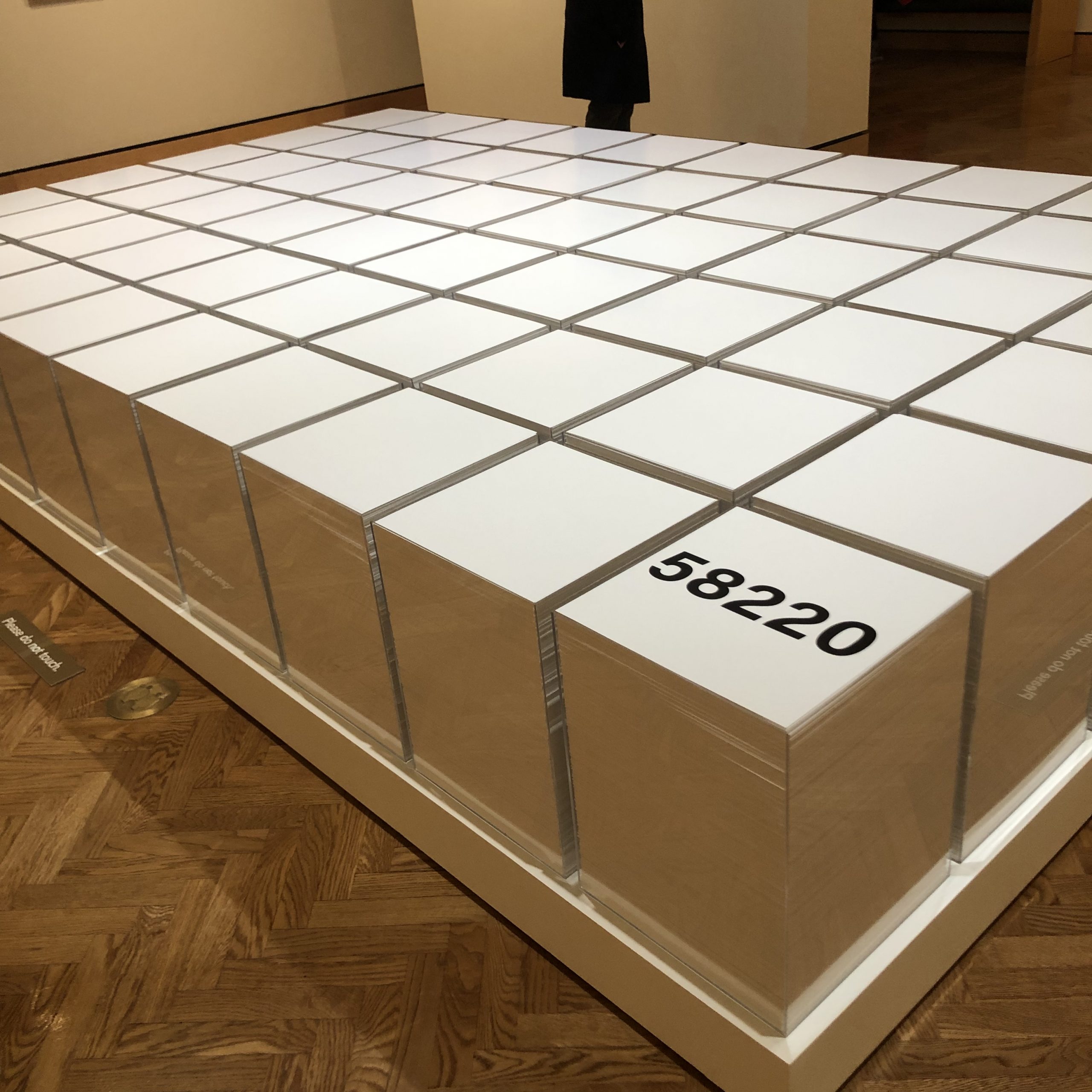
EM: I observed a sense of hidden bodies most intensely with Remembering Other, which consisted of stacks of white paper in transparent acrylic boxes, physically illustrating the scale of loss of life on behalf of the Vietnamese people, both military and civilian casualties. There were also paintings that implied hidden bodies to me, but much more subtly via the compositional choices.
Teo Nguyễn, The Singing Stops in All the Trees, Hát Trên Những Xác Người (2016) acrylic on vellum, mounted to aluminum
GHT: Translation is used thoughtfully throughout the entire exhibition. However, from my understanding of the Vietnamese language, the translation is loosely connected and leaning more poetic rather than precise. (For example, The Singing Stopped in All the Trees isn’t exactly a one-to-one translation for the title Hát Trên Những Xác Người, which translated literally to To sing on top of bodies). Along with the artist’s mother’s poem display, language seems to wield as much power as visual in the exhibition, and I’m curious what you think about the role of language, translation, and written text when paired with visual art.
EM: First, I feel lucky to get your insight here as a speaker of Vietnamese. The difference in translations is stark, and illustrates just how much power the translator wields. Having both written material and visual art side by side in this case helps highlight how each medium has its own strengths in different ways. Sometimes the specificity of words seem more decisive and pointed, directing the viewer/reader to exactly what the artist/author wants us to observe. In contrast, at other times the image is most impactful because it shows us, rather than describing what we should pay attention to. Each viewer translates those images based on their personal context, whereas with the translated text, some conceptual choices are made for us.
Further discussion in the video below:
Disclosure: I know Genie Hien Tran as a past student when I was directing the MFA program at MCAD.